source of this post comes from:
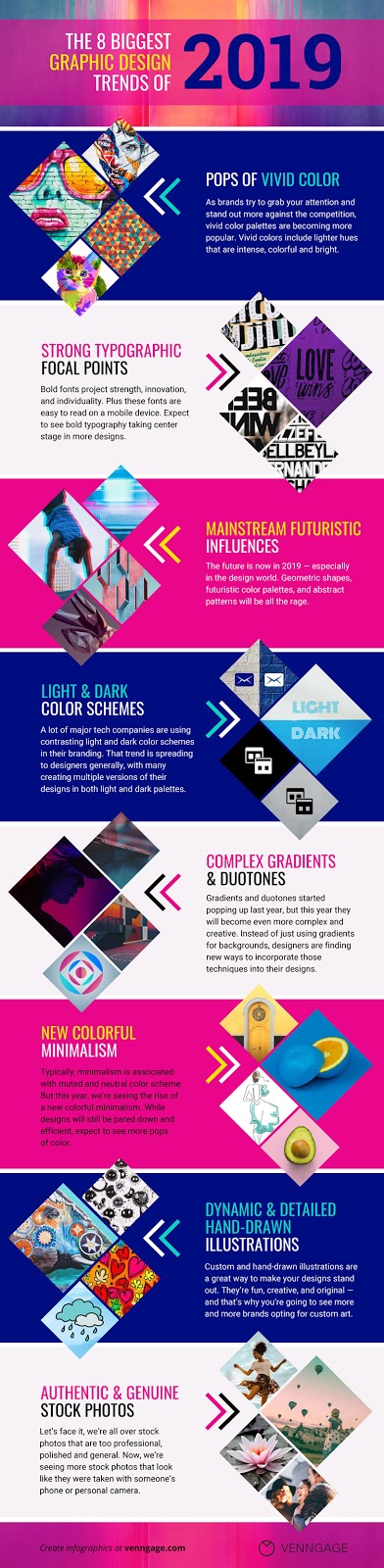
1. Pops of Vivid Colors
You may have noticed the world of design feels a little more colorful lately. You would be right.
Splashes of electric yellows, bright corals and vivid blues are replacing the reserved colors of the past. More brands and designers are adding vivid colors to their palettes for 2019 and beyond.
I love it–more color is always a plus in my books!
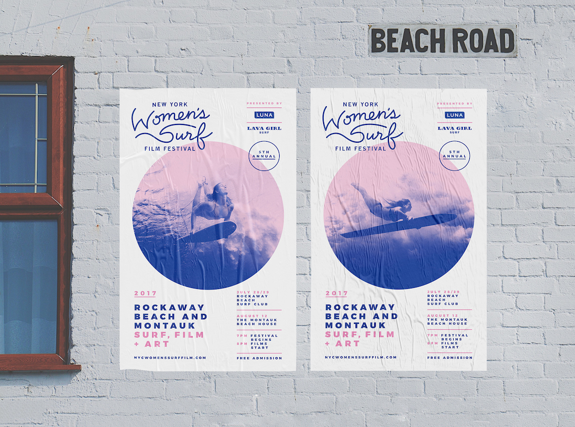
If you aren’t familiar, vivid colors include lighter hues that are intense or attention-grabbing. Kinda like the blues, pinks, and reds in the example below:


I believe that this shift towards more vivid colors is a continuation of the rejection of bland minimalism of the early 2010’s. Also, as brands proceed to fight for our attention, they must take bigger design risks.
Last year was dominated by bold colors, this year very vivid and bright will reign supreme.
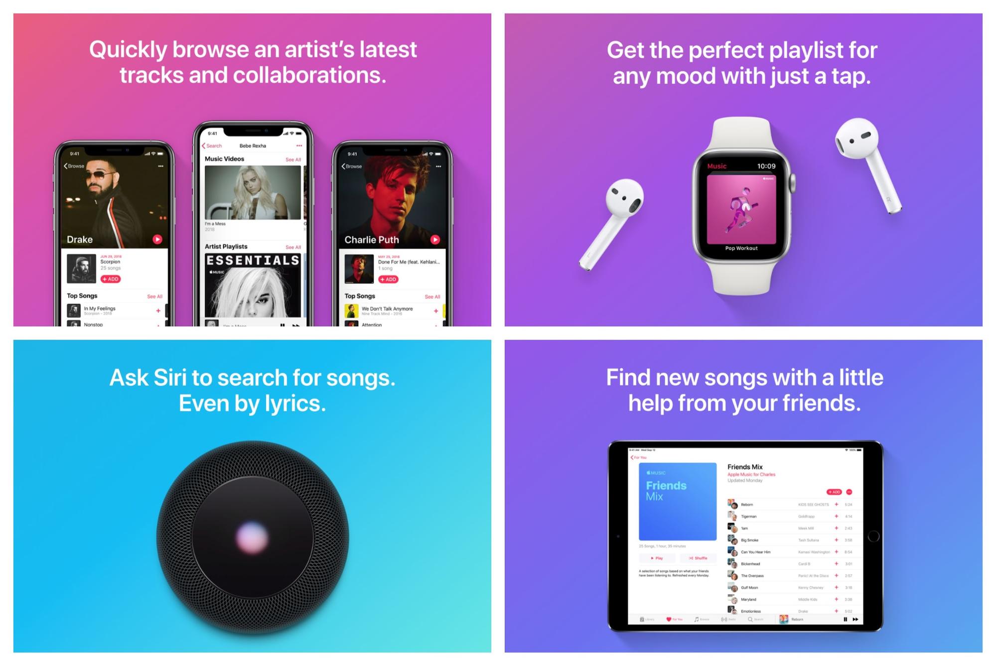
After one of the largest trendsetting companies, Apple, added vivid colors to their designs a few weeks ago, I expect these colors to continue their takeover.

As you can see, they used a bunch of vivid color palettes to announce the new iPad Pro…and it was a hit!
We have already seen vivid colors start making their way into other Apple graphics as well:

But I think this year these vivid colors will become part of their core creative and brand strategy. Plus these colors just look amazing on their, and other brands, ultra HD device screens.
Spotify is another big brand that is usually ahead of the most popular trends, and this year is no different. Bright, vivid colors have made their way into their marketing material:

And on their wildly popular app:

We saw Spotify embrace gradients, bold colors, and flat design before it was fashionable, and I see bright colors taking the same path.
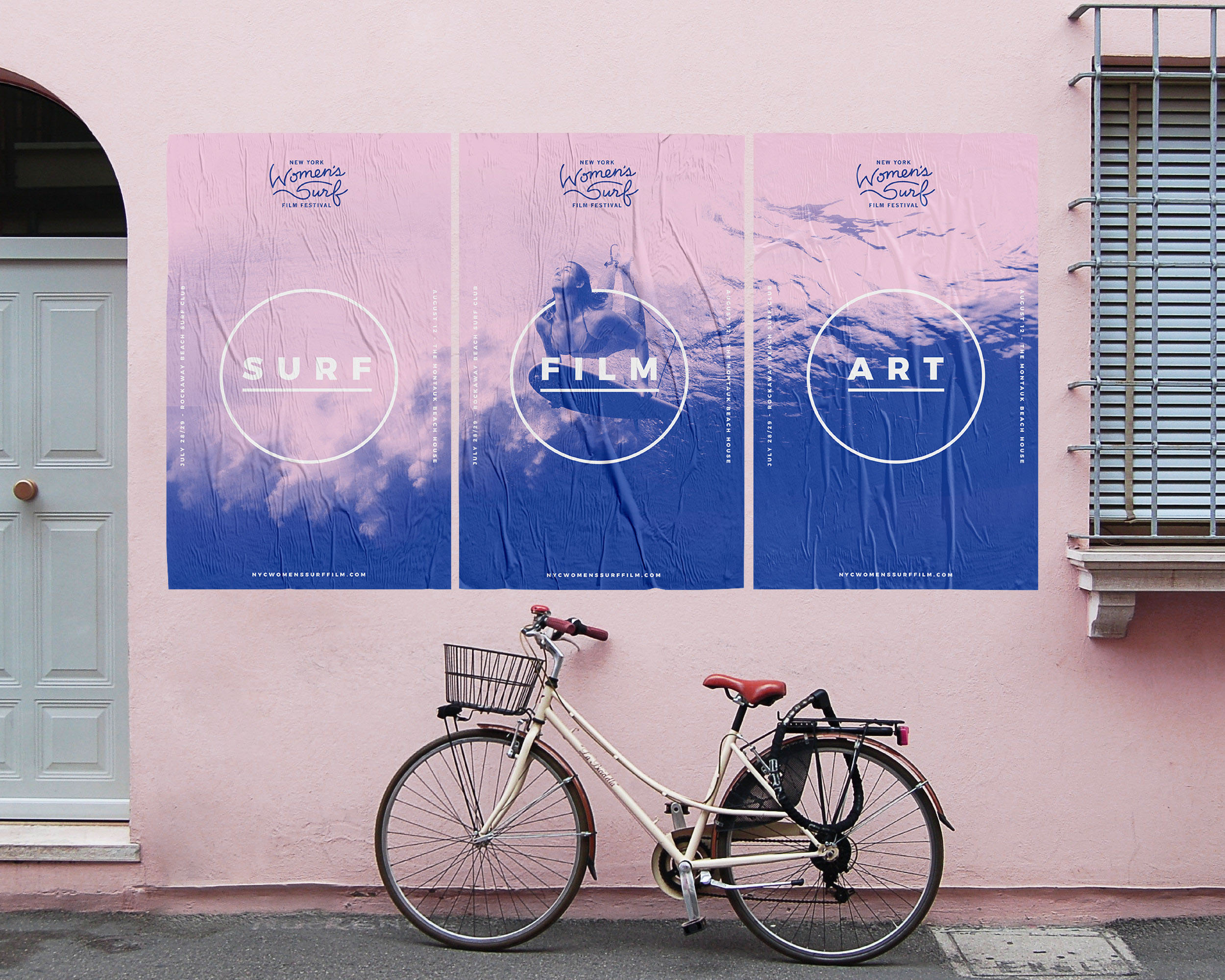
I do think it’s important to note that you don’t have to only use vivid colors. In fact, mixing those color with stronger or flatter colors will help you stand as well. Check out how well the colors come together in the presentation template below:
2. Strong Typographic Focal Points
Over the past few years, we have seen bold fonts and typefaces become the norm.
From Adidas using it across all of their marketing:
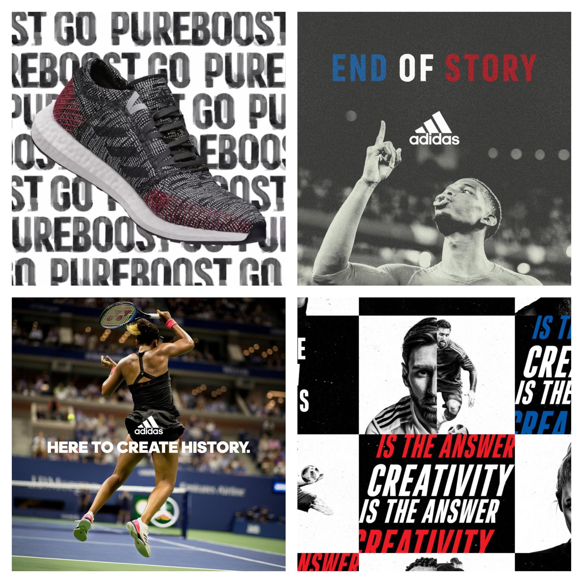
To Samsung, which illustrates nicely the move to more vivid colors this year as well:
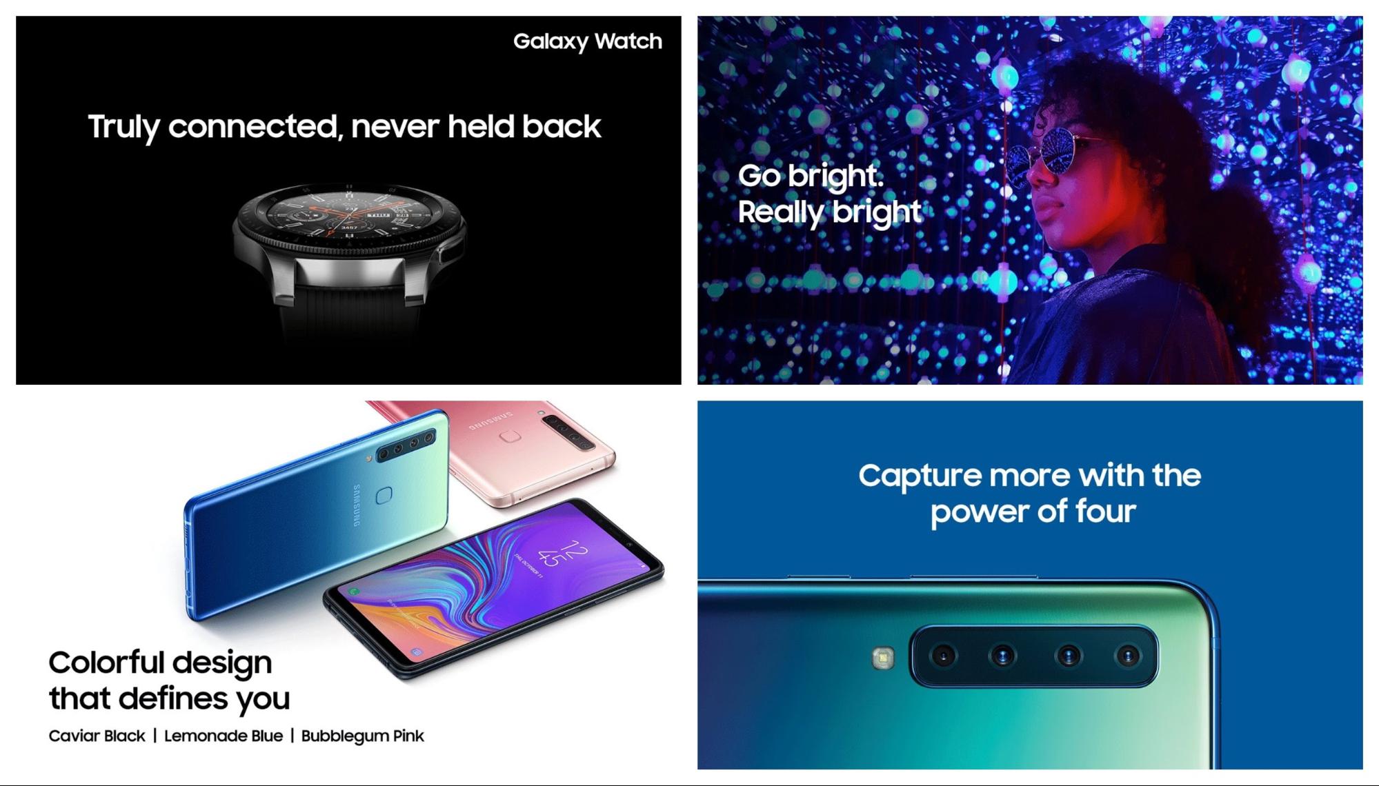
This bold font makes it easy to read the text on social media feeds and on mobile devices. As well as instantly projecting strength, innovation, and individuality.
However, as you can in all of these examples, the bold font is often the supporting partner to the other design elements.
But this year the bold font will become the main focal point in a lot of graphics. Especially if your graphic only has a few seconds to grab the reader’s attention.
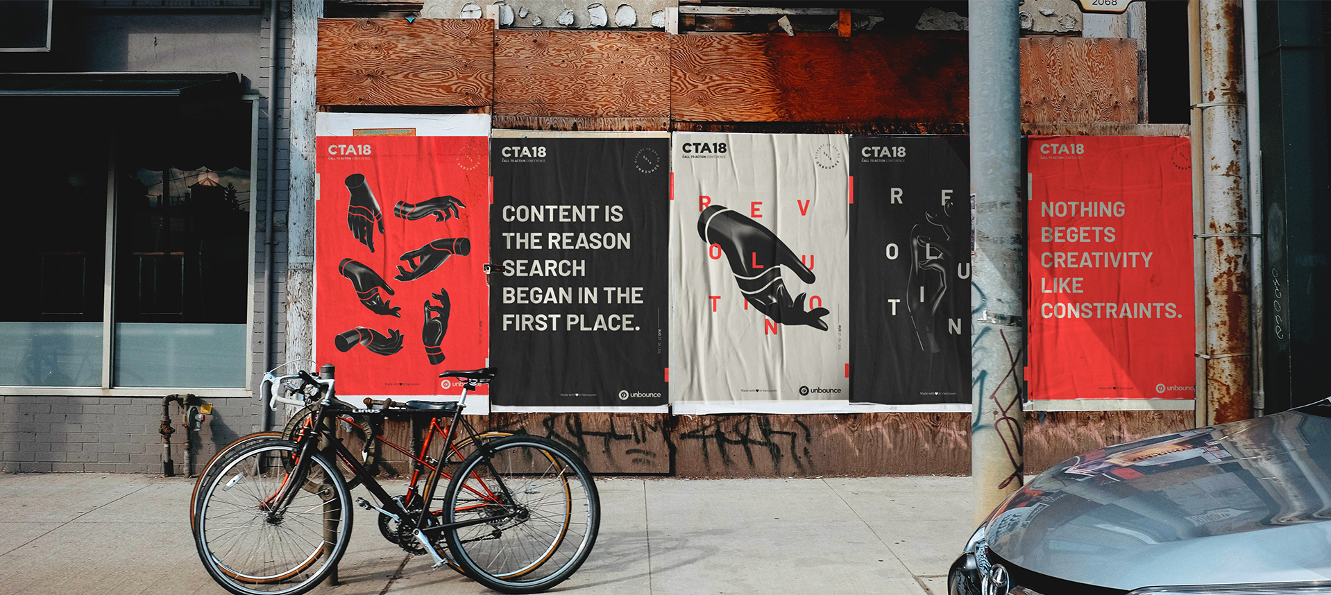
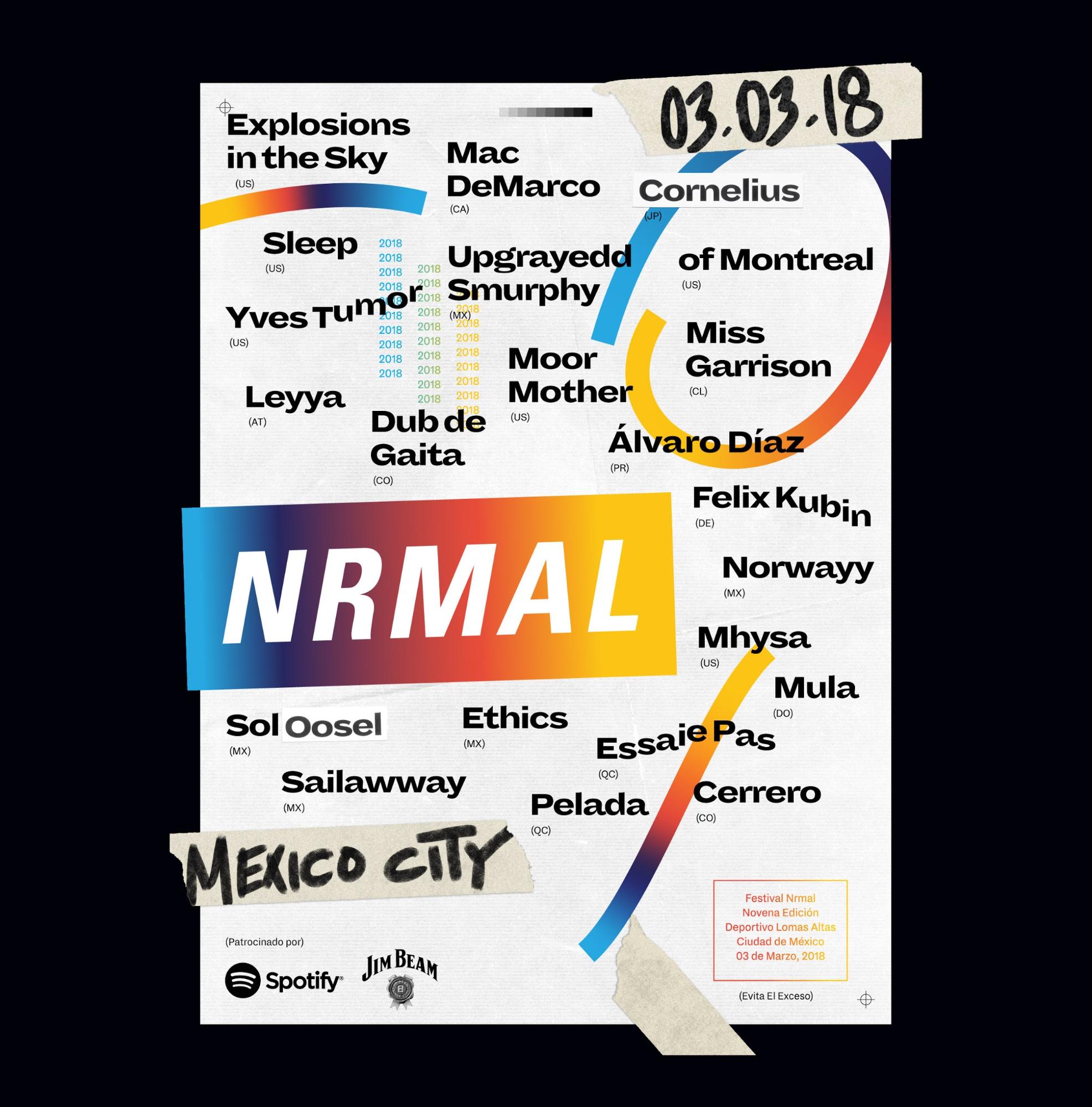
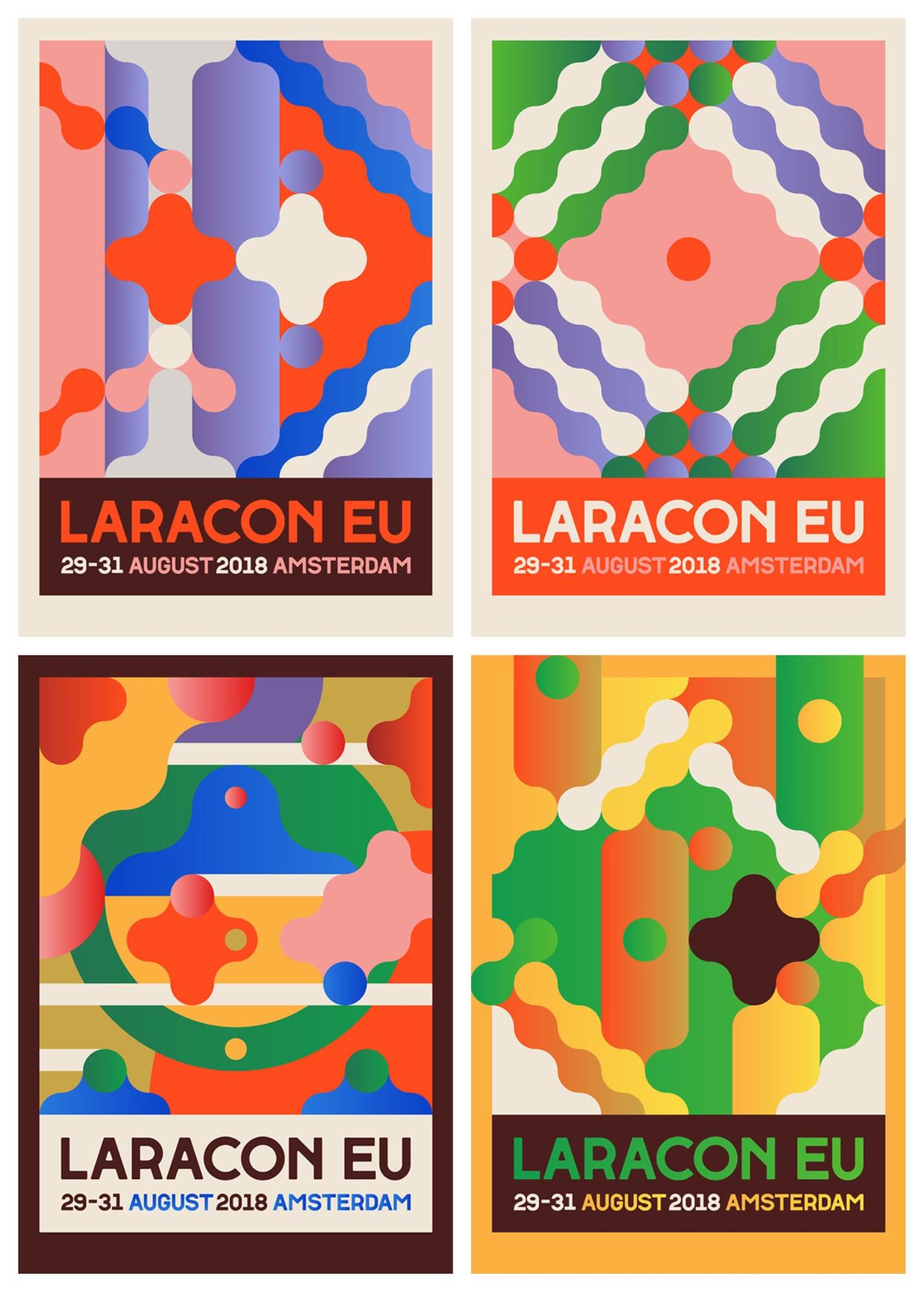
Like with a poster, social media graphic or flyer. In these poster examples from the CTA18 conference you can see how powerful a bold font can be:
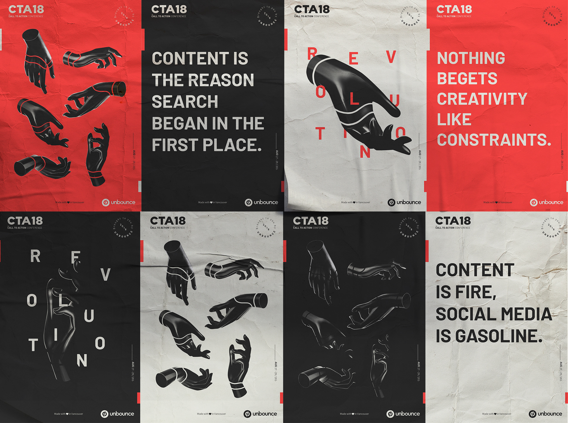
Each of the font-heavy posters stands out like a beacon, compared to the other futuristic-looking posters. Even if you knew nothing about the conference or company it would pique your interest.
This bold font was used throughout the rest of their conference material and it helps project a daring and confident message.
All of this was achieved with a single bold font, and no supporting images.
Another great example of using bold font comes from Nike at the Public School New York Streetball Classic:
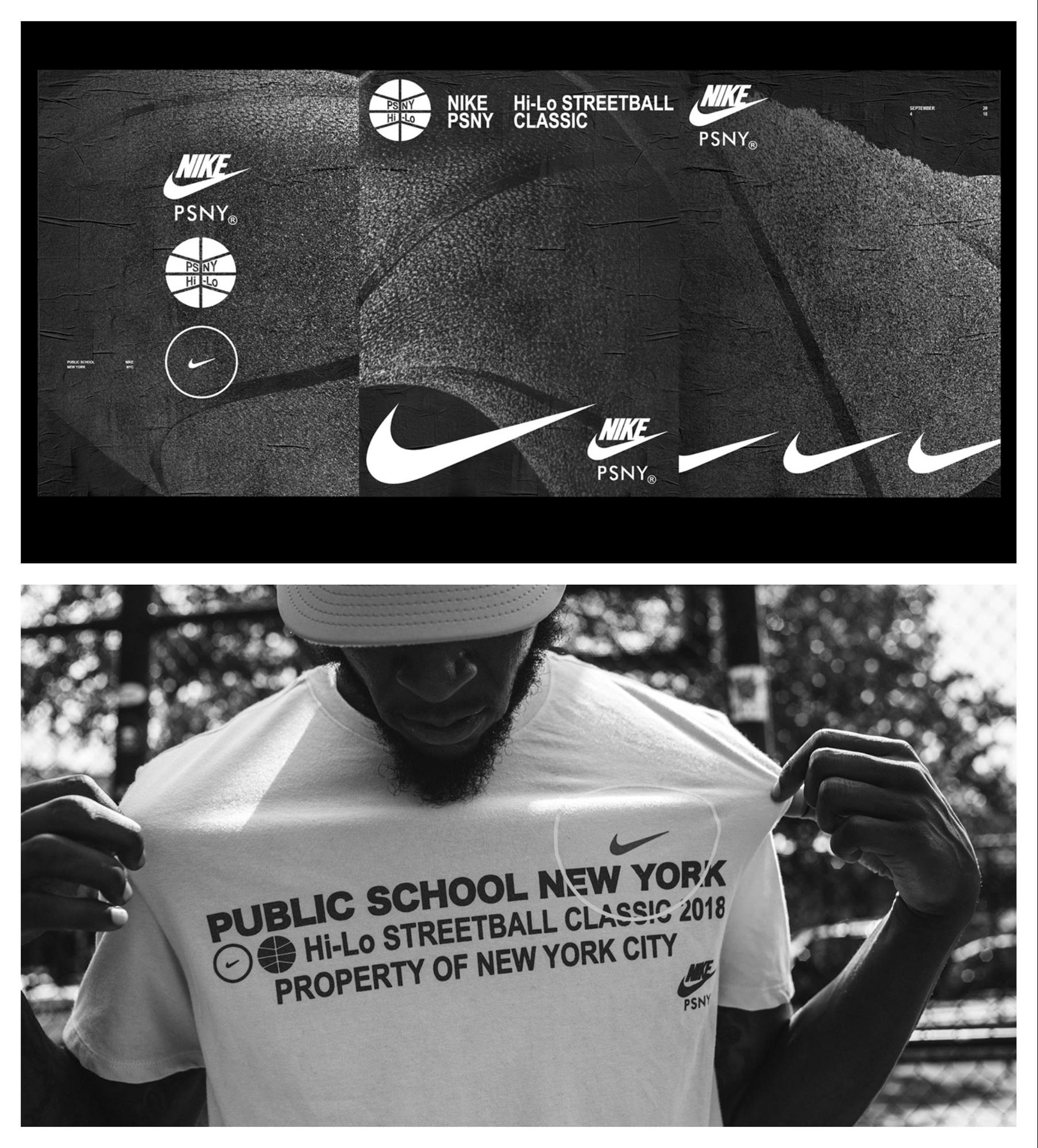
This bold font just screams strength. It’s extremely fitting for an athletic display. Plus those posters will definitely stand out on the busy streets of NYC.
If you’re looking for something a little more colorful, check out the bold font used on this design project from CalArts:
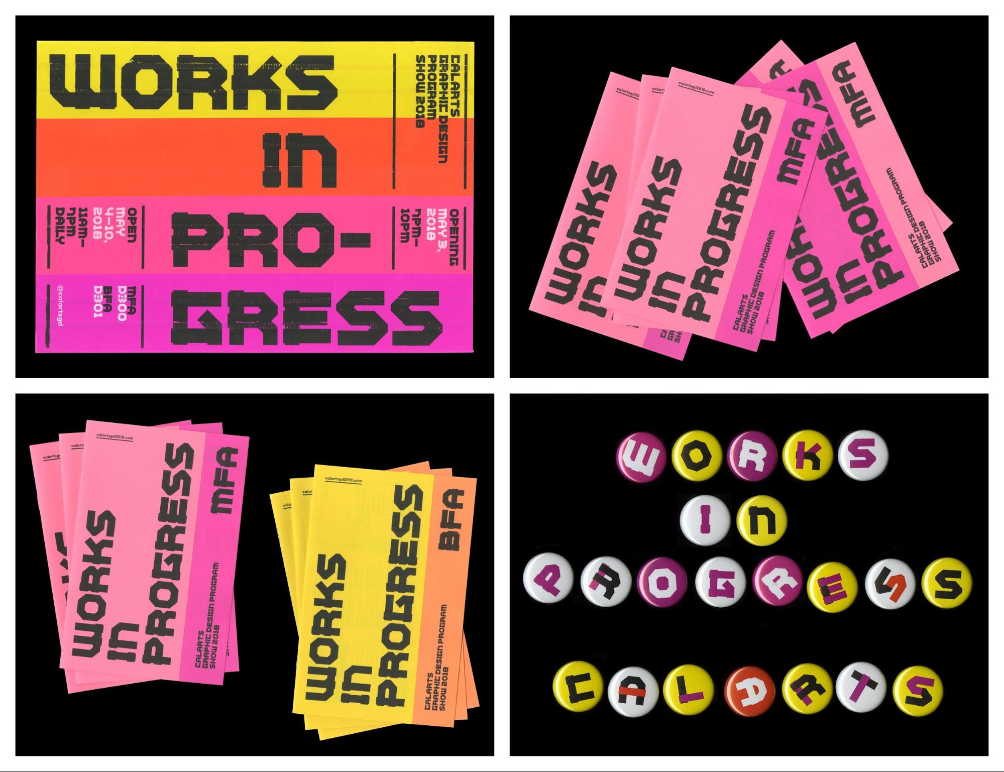
It dominates the graphics but fits extremely well with the vivid color palette. Could you imagine a minimalistic font having the same effect? I think not!
This example is begging you to read more. It could even catch your eye from across a crowded room.

I do think it’s important to point out that I’m not advocating only using text-heavy graphics. There should be some other interesting elements included, like in this gradient-filled festival flyer:
This modern sales poster:
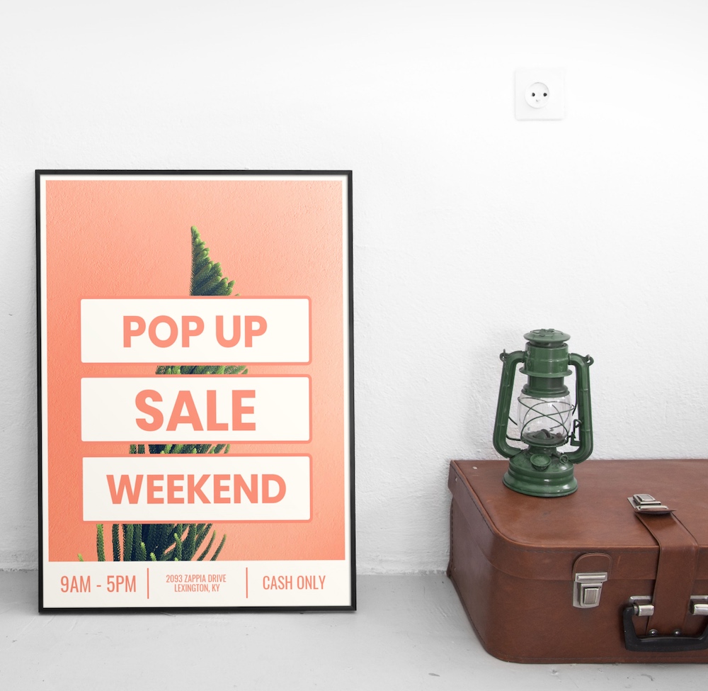
Or this brilliant flamingo adorned hiring poster example:
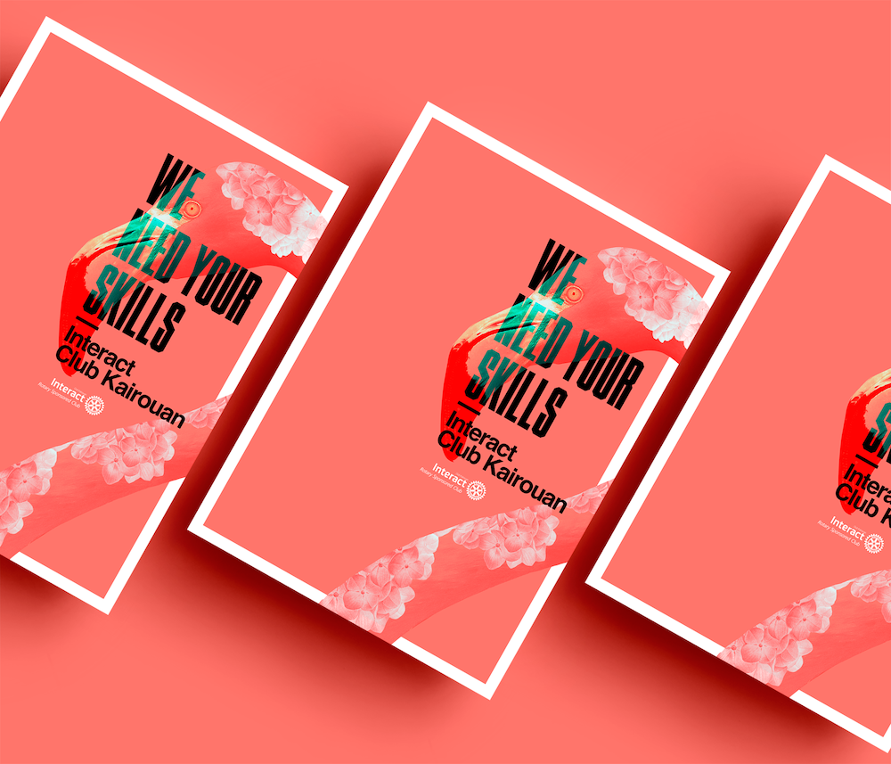
The main header and font of each example definitely grab your attention, but the other elements could be what catch your eye first.
So don’t forget to include some of these interesting elements, even if you want the text to be your central focal point! The harmony between all of those elements could really make or break your designs in 2019.
3. Futuristic Influences Are Mainstream
I guess since we are technically living in the future that so many 80’s films predicted, it’s time for our designs to reflect that.
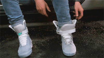
This means a lot of futuristic patterns, colors and ideas are about to dominate the design world for the next few years.
We do have most of the futuristic devices they predicted in our pocket each day. So you might as well take advantage of that tech with your design work!
I believe that this approach will help brands create unique content that will stand above the noise on social media.
The visual rebrand of BBCTWO this year is a solid example of a large brand embracing this idea:
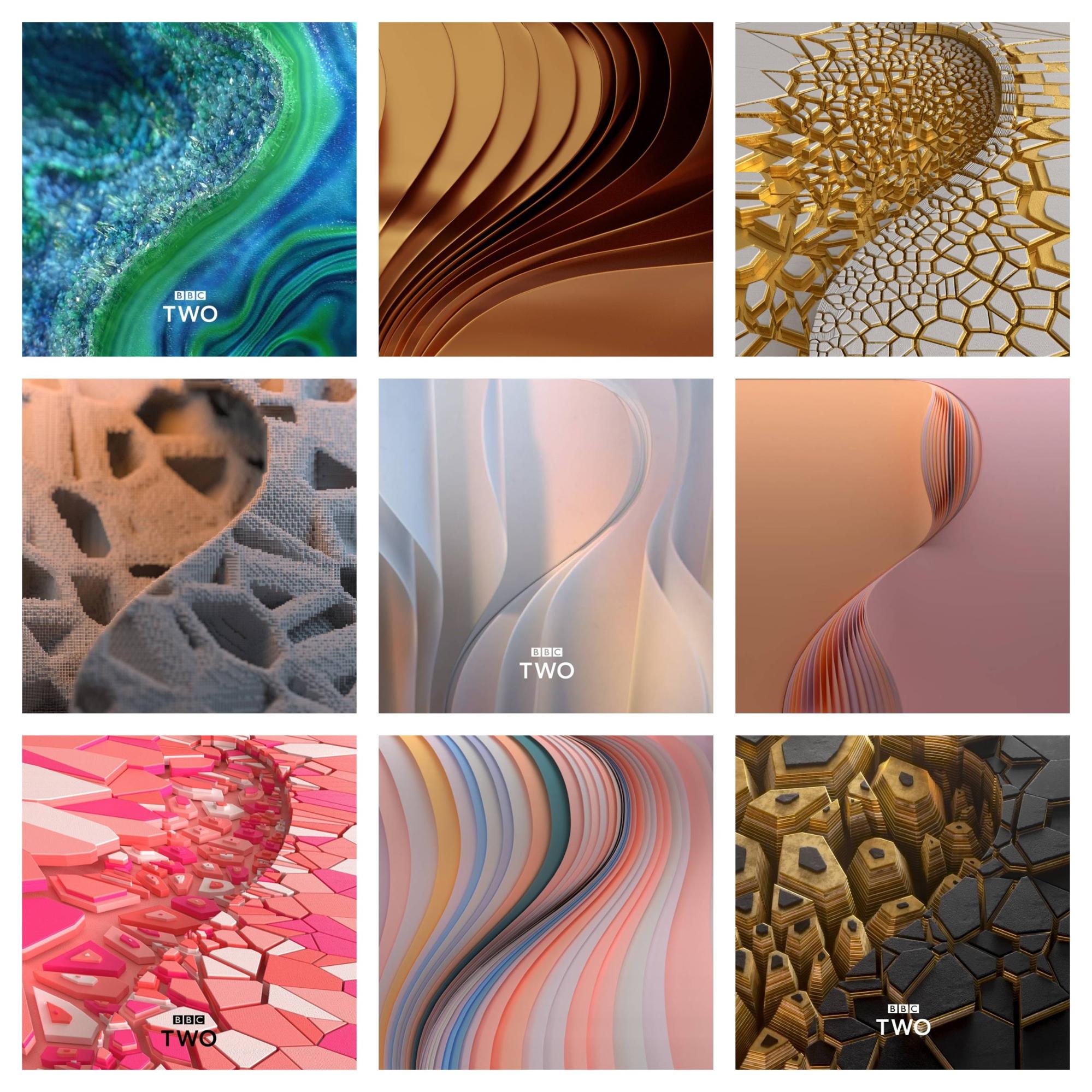
They could have taken the boring route that so many brands take and just refresh their typeface or logo. But they have let the futuristic patterns, textures, and colors define their branding across all of their content.
Additionally, I don’t think it’s a coincidence that the rise of vivid colors matches up almost perfectly with the explosion of futuristic influences. They both have been used recently to stand out from the noise created by other brands.
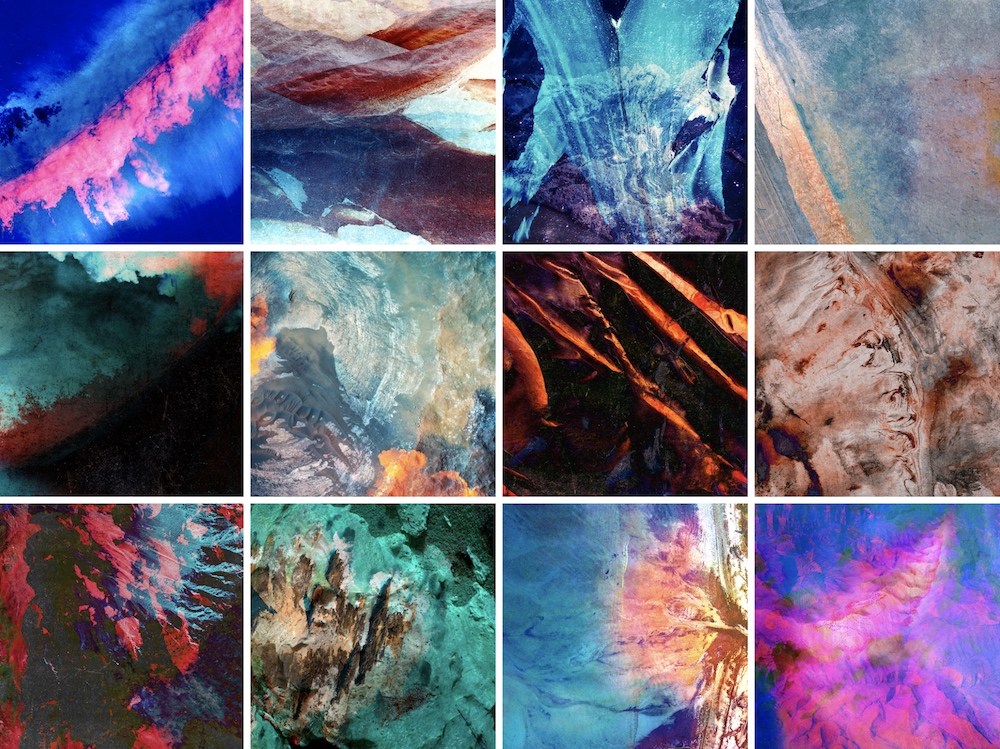
When futuristic designs and vivid colors are used together, they can create something really cool. For example, these album covers from the europe.collective project looks like they were ripped from a futuristic record store:

Honestly, these are works of art and are likely to stick in someone’s mind a lot longer than some of the other album covers I have seen.
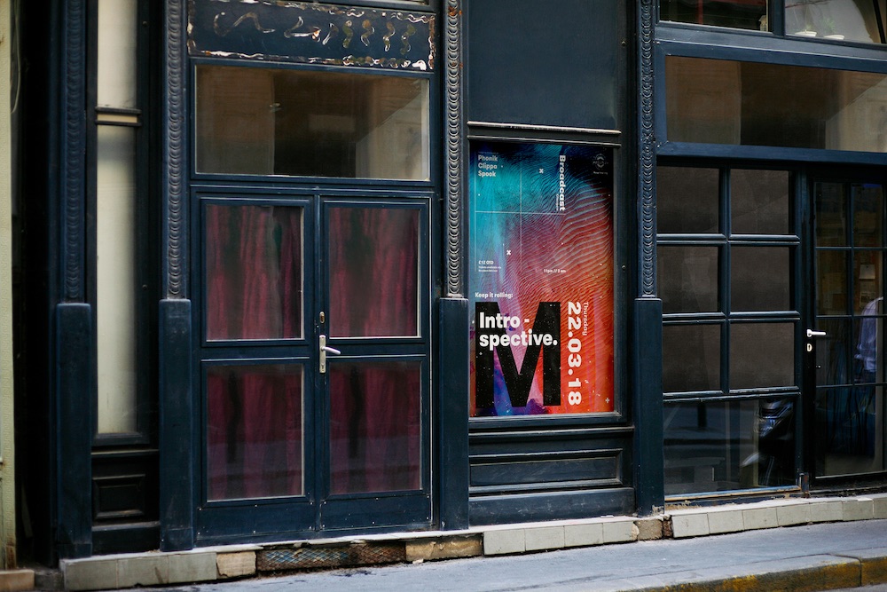
Plus these futuristic examples will look amazing on your iPhone, Android or Mac screen. Or on the side of a building, like with this innovative event poster example:
With futuristic designs, you can take a lot of risks and let your creativity run wild.
Let’s break down some of the common elements of these futuristic designs:
Bright color palettes:

Gradients and other color transitions:

Abstract patterns:
“Glitches”:
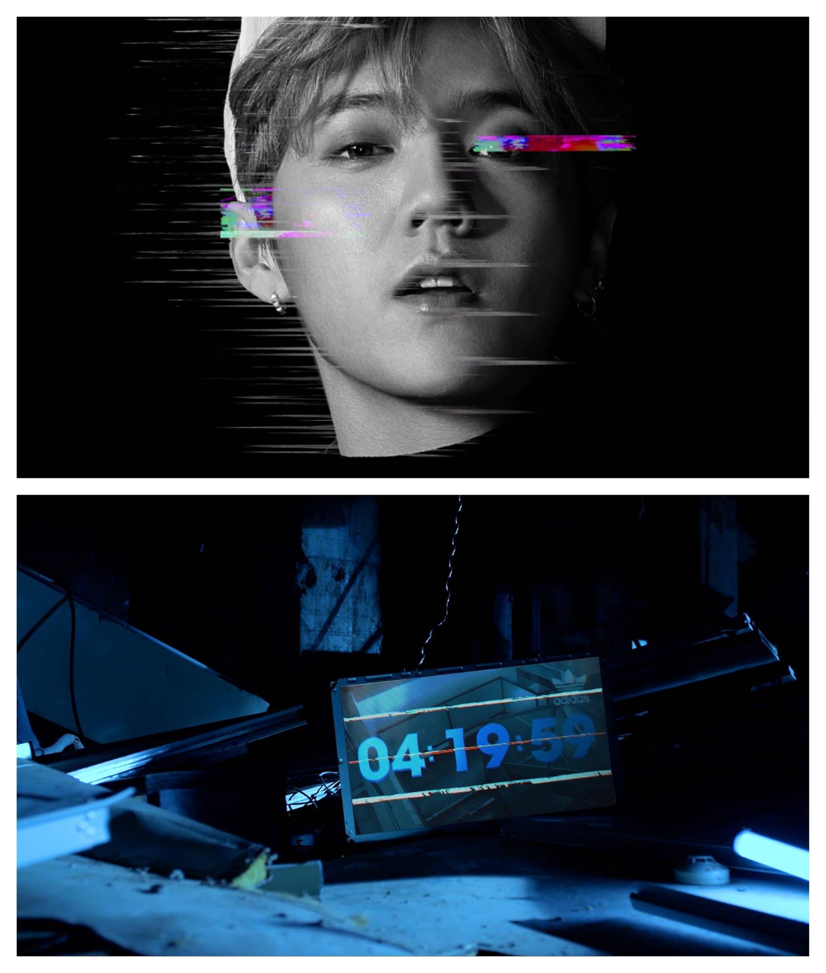
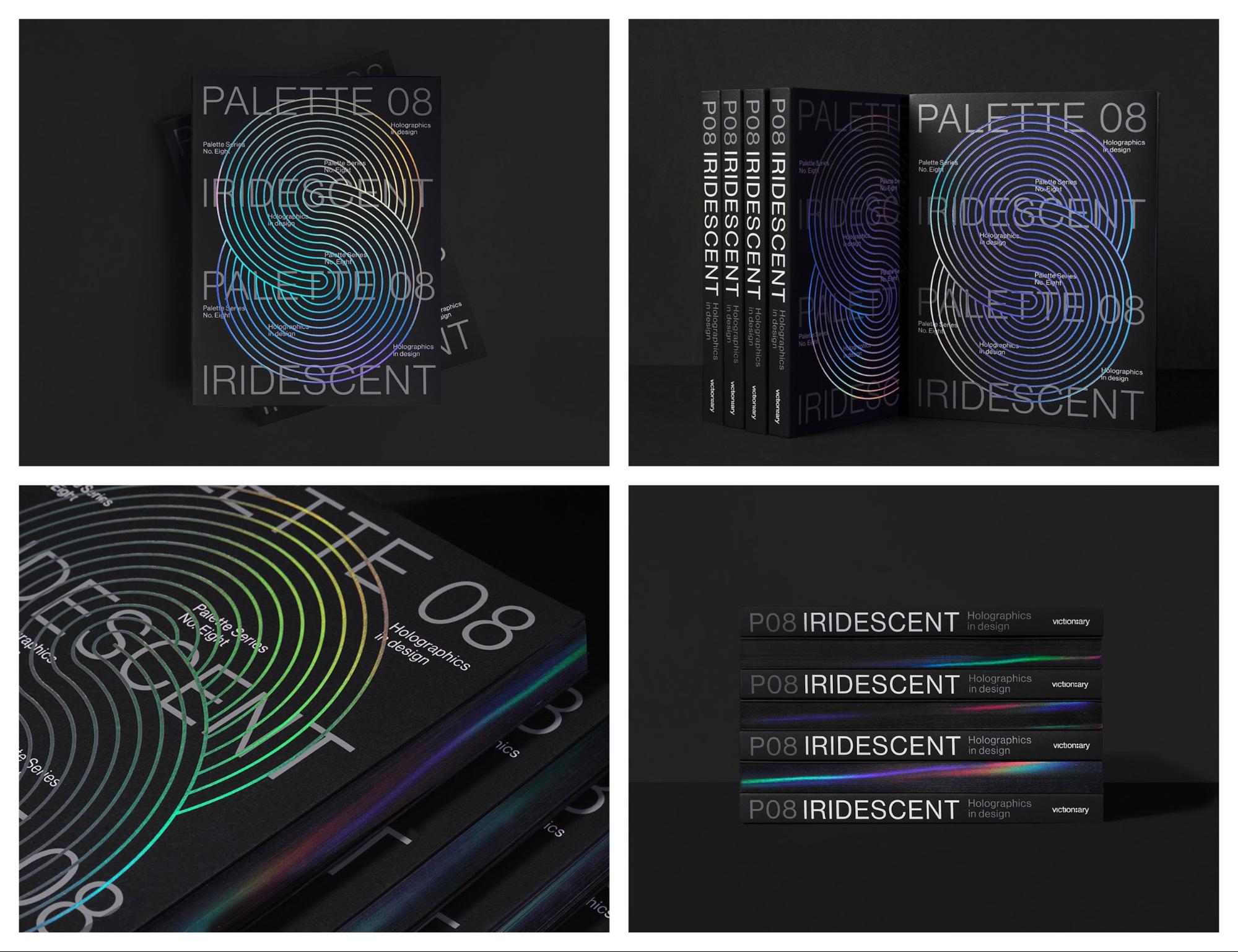
Holographic and reflective elements:
Geometric influences:
…and more! But since we don’t know what the future holds, there’s no right way to do it! So get out there and create something that looks like it was ripped straight out of your favorite science fiction movie.
4. Light and Dark Color Schemes
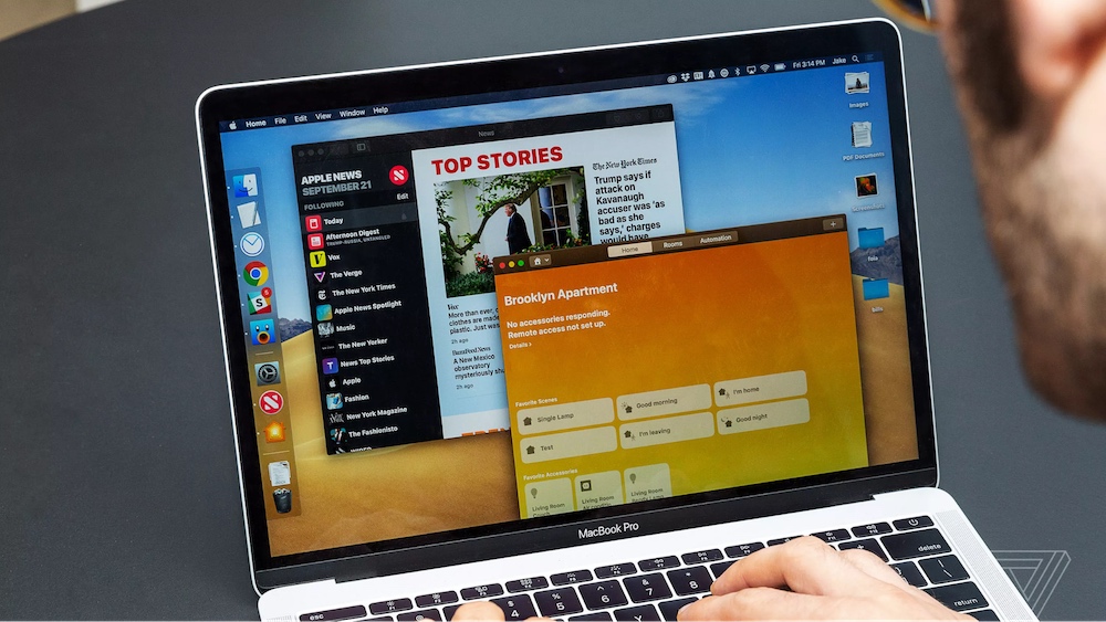
You may have noticed that some of the largest companies are adding light and dark modes to their apps. Or embracing light and dark color schemes across different devices and avenues.
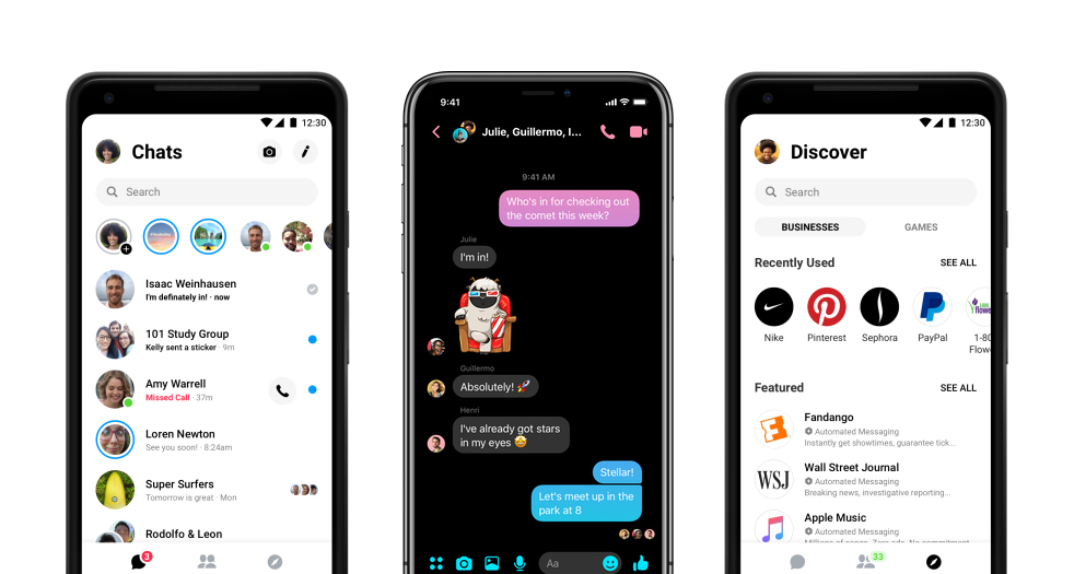

You may be asking why I’m highlighting these companies now. I do like talking about tech companies but that’s not the reason.
Instead, I wanted to point out that the biggest brands in the world of tech are embracing this dual colored design trend. So it’s pretty easy to see the graphic design world wholeheartedly adopting it this year.
These apps use different modes to make the apps more useful for the user depending on the situation. You can use this same flexible technique in your design work to instantly adapt to many mediums or screens.
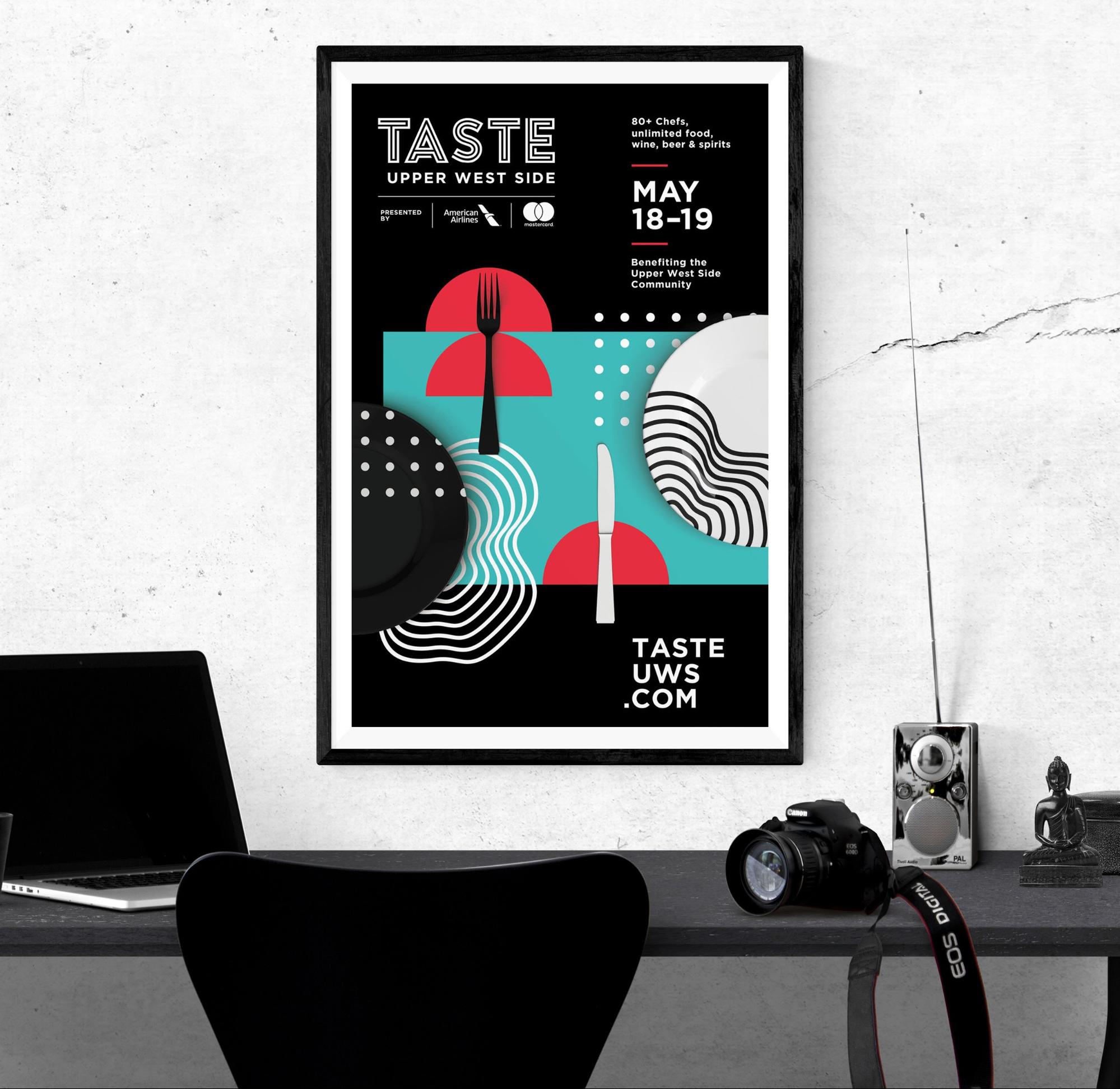
In fact, one of my favorite flyer examples uses a light and dark color scheme. Each fits the subject matter and event extremely well:
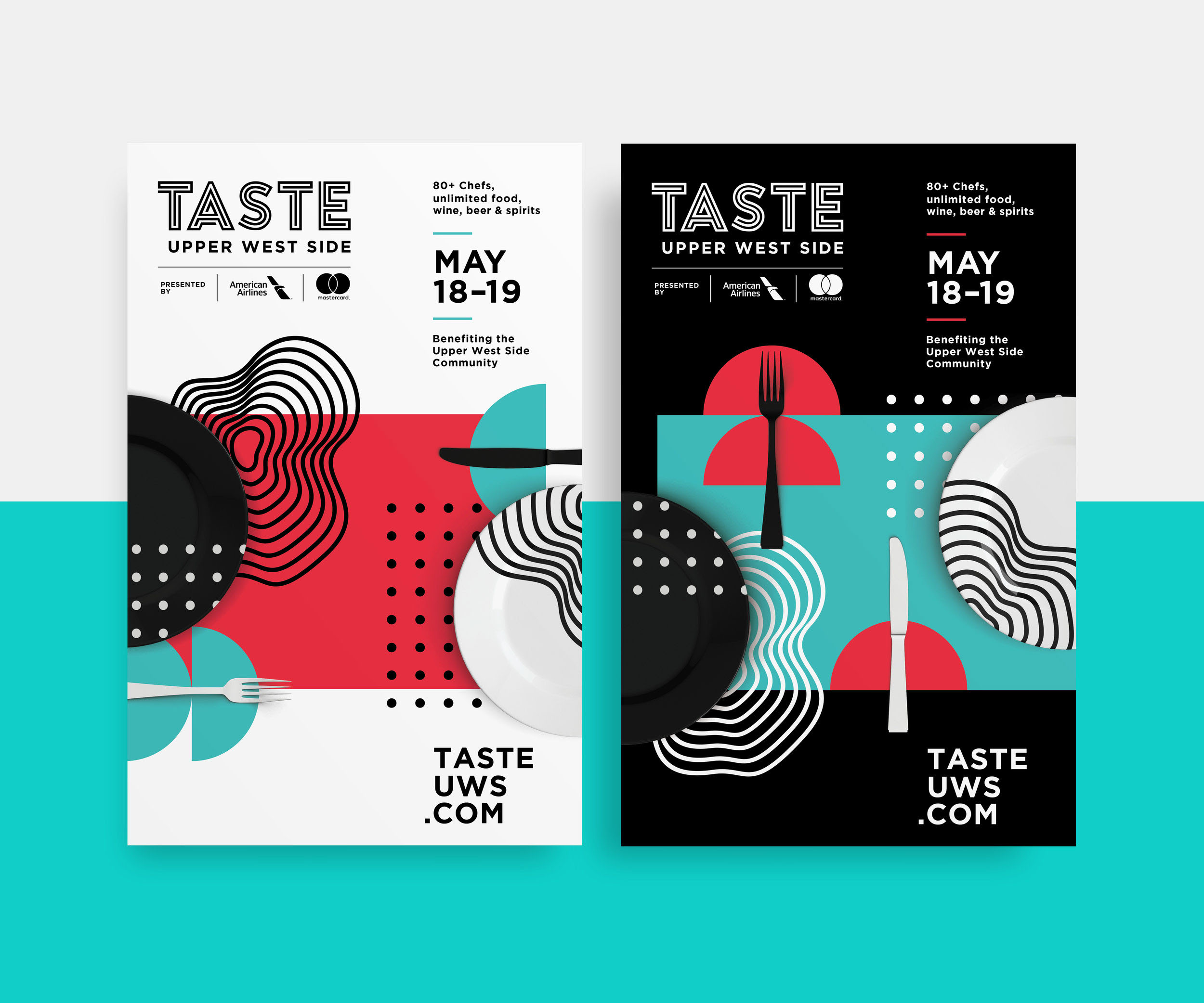
Like I said above this dual color scheme makes the poster a lot more flexible. If you need to hang it up on a dark wall, the white colored poster is perfect.
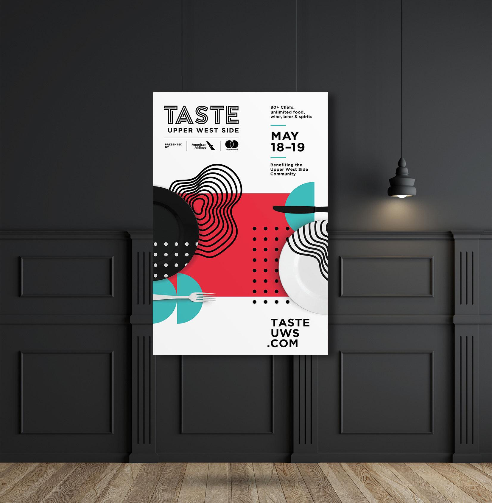
But it also won’t stand out if you need to place a poster on a blank office wall, which is where the black color scheme saves the day.
In these beautiful poster examples, the designer used a duotone blue and white as the main color influences. But it has the same effect as the flyers above.

With this kind of technique, you’re not putting all your eggs into one basket. Saving you from a ton of wasted time and effort.
The light one could catch the eye of some people, but the dark one could do the same thing for another group.
The change between light and dark graphics can be quite subtle. For example, in these graphics they only really change the borders from light to darker colors:
It may seem like a lot of work to create multiple versions of your design but with the Venngage Brand Kit, you can switch between color palettes with a single click.
You can also import your brand colors, fonts and logos into your Brand Kit. Then you can automatically apply them directly to your designs or templates. Like so:
You already have a battle-tested palette of colors that your audience recognizes. So why not use them!
5. Complex Gradients and Duotones
Gradients are one of my favorite things to add to any design project to give it a little more depth. Plus, like some of the other rising graphic design trends, they look incredible on mobile devices.
Last year I predicted that gradients would begin to take over the world. Especially after seeing large companies embrace it, like Microsoft:


With their vivid colors and futuristic patterns, they feel right at home with some of the other graphic design trends of 2019.
However, I think this is the year the gradient grows up and is used in more ways than just a simple background. Just like any new trend, people are going to find unique ways to use it as time progresses.
For example, take a look at how Fast Company uses gradients as color filters across their content:
This simple overlay can instantly upgrade even the blandest stock photo. Also, this visual strategy can become part of their brand, making it easier for readers to spot their content.
Overall it’s a simple way to differentiate from the competition that even the most novice designers can emulate.
After seeing the rise of gradients last year, we added the gradient backgrounds to Venngage. Apply them to your designs in a single click:

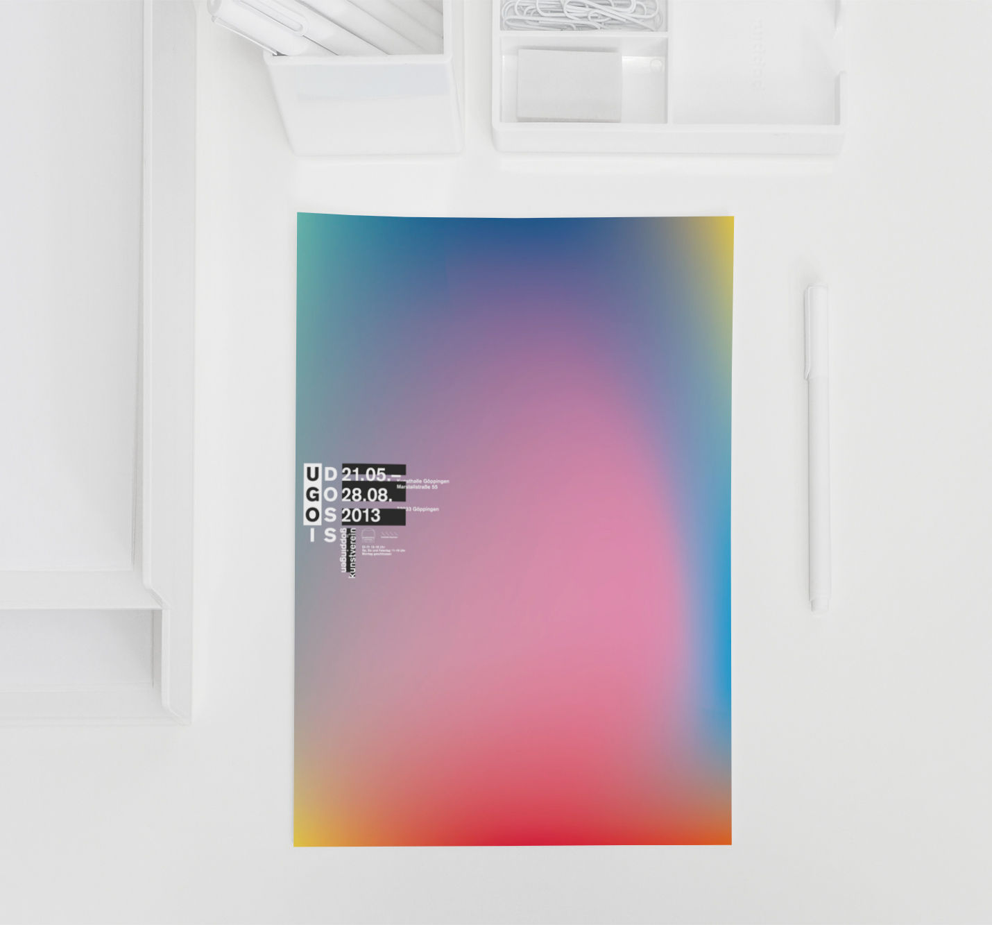
If you’re looking for something a little more complex, check out these examples from the Adobe 99U Conference:
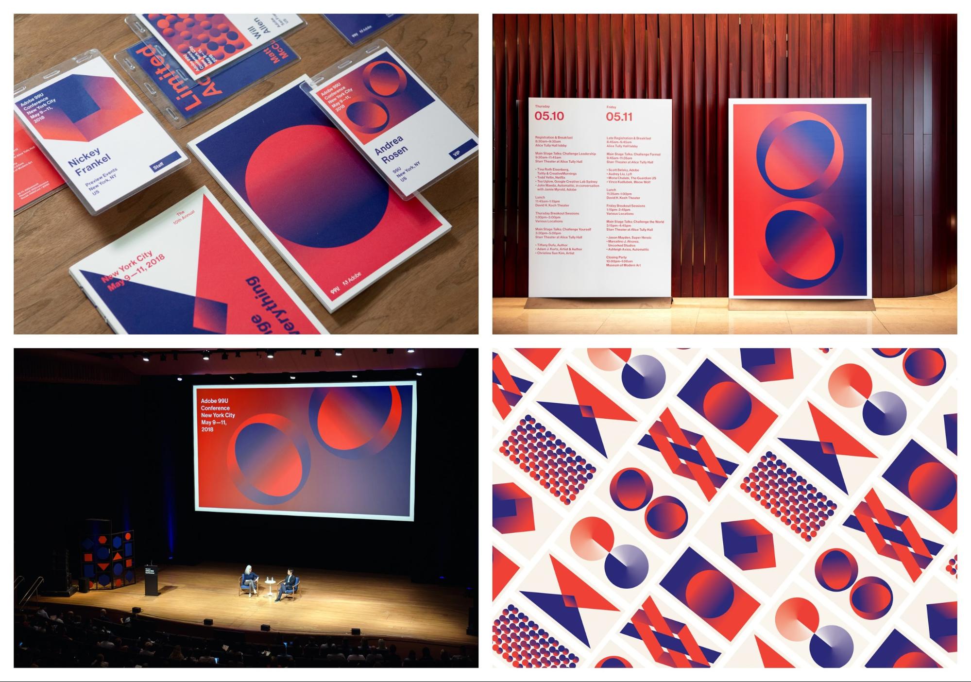
In these examples, the gradients are the main focal point and dominate the graphics. In the past, they would have of being pushed to the background and only played a secondary role to another element.
This approach takes a little more skill to master, but definitely will stand out:

And if gradients were used to advertise, say, a conference on the future of design, I think it’s safe to say they are here to stay.
If you want to blow readers out of the water, take note of these slides from the Ringling College Motion Design conference:

These slides are literally called “Future Proof” and feel like they were pulled straight from an episode of Star Trek or Blade Runner. I could honestly look at them all day, or make them the background of my laptop. Actually, maybe I will!
Duotones are another design tactic that fits extremely well with the other design trends. Most graphics that use duotones feel very futuristic and colorful, almost by definition.
In the simplest terms, duotones are images that replace the whites and blacks in a photo with two colors. Like how the graphics designers at TQ used a blue for the dark parts, and a pink for the lighter ones:
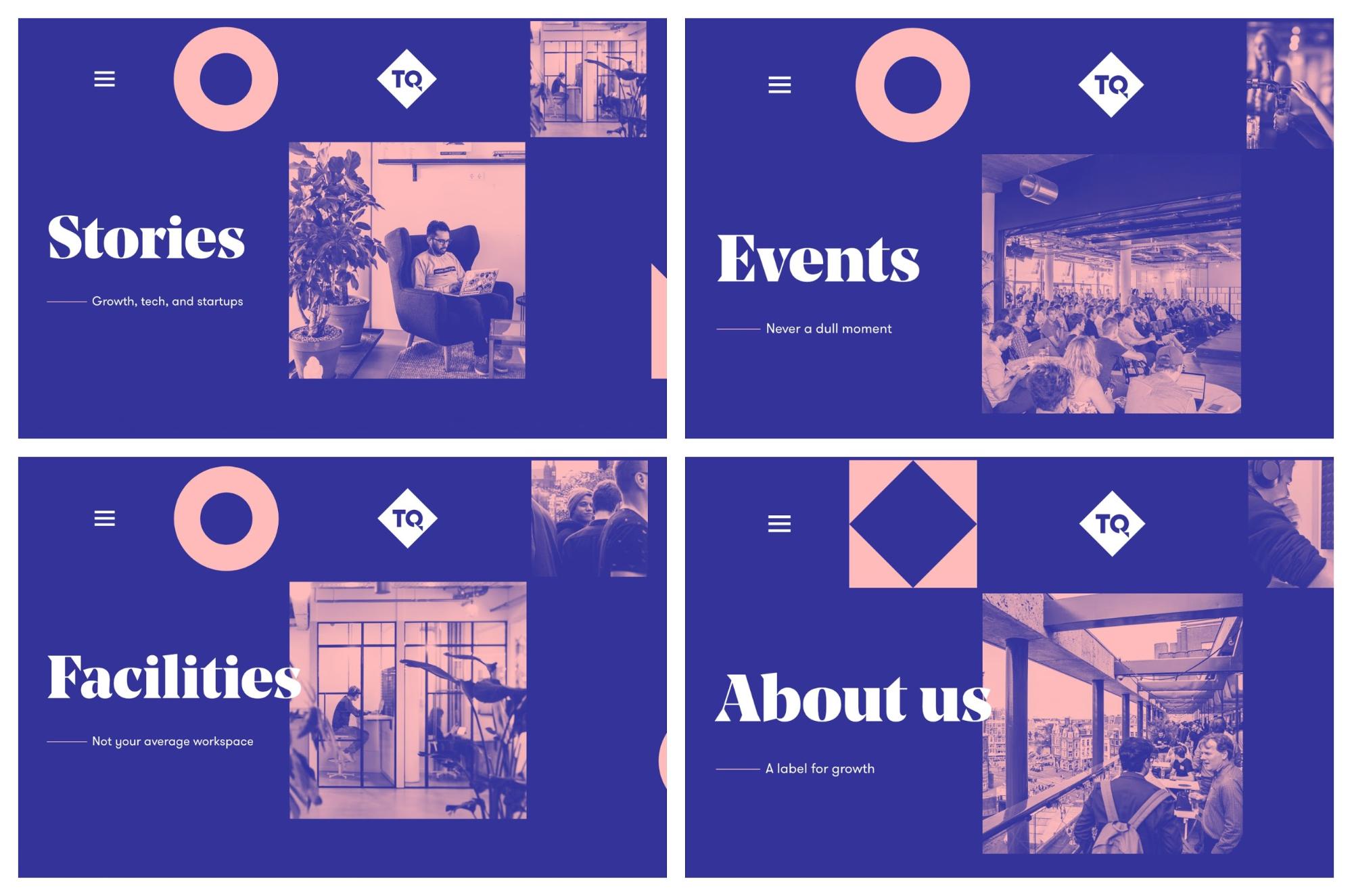
I like duotones because you can make almost any image match your company branding. And as you probably know, keeping things consistent is extremely important in the design world.
Duotones aren’t as popular as they once were a few years ago. But they still can be used to create some interesting graphics, like these blog headers from The Health Diaries:
Additionally, like gradients, they really pop when used on a white background, social media or a mobile phone.
6. New “Colorful Minimalism”
I think it’s pretty common misconception that minimalist design only used black text and white backgrounds. Or another combination of the two.
But minimalism is actually about paring down design to only the necessary components. It’s seen as the rejection of complicated and cluttered ideas.
Many people have interpreted that as using only muted and neutral color palettes. Especially after the main tech giants used it for about a decade in their marketing.

A lot of the graphic design trends I have witnessed over the past few years have been a reaction to that kind of minimalism. From the explosion of hand-drawn graphics, bold color schemes, and abstract patterns. Each of those trends is the opposite of what minimalism is at its core.
Despite that, this year, some of those more complex graphic design trends are going to mix with traditional minimalism to create a new type of minimalism. One that is dominated by color and creativity, instead of blandness and conformity.
For example, take a look at this product poster series from Nike:
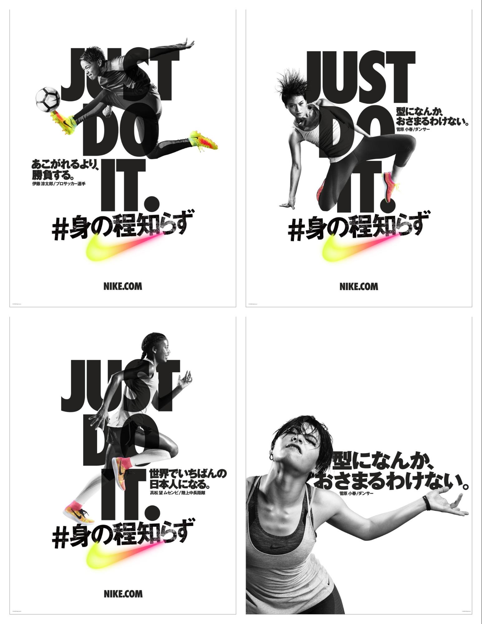
Each poster is traditionally minimalist, with not a lot of flair or unneeded elements. And without the vibrant gradients, it’s just another boring poster.
But this simple color addition makes it very eye-catching, without abandoning the main tenets of minimalism. It masterfully walks the fine line between too dull and too complex.
You can also take some of the ideas we have outlined in this article and integrate them into your minimalist projects. Things like a bold font, futuristic elements or a simple gradient can really upgrade your simple designs:
Just be sure that they don’t dominate the graphic, and instead are used in a supporting role to other elements.
These logo examples from Aula Visual are a perfect illustration of that idea:
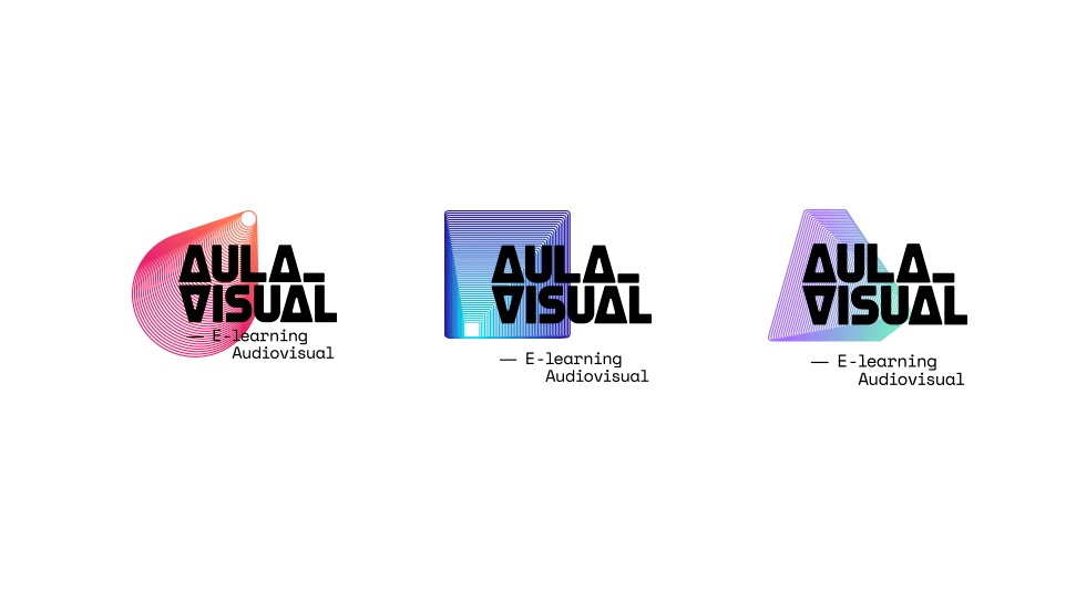
In each of the graphics, both a futuristic pattern and color are used to up add a little something extra to the brand mark. Without those elements, I think this would just be another boring logo.
The same thing can be said about these graphics for Black[Foundry]:
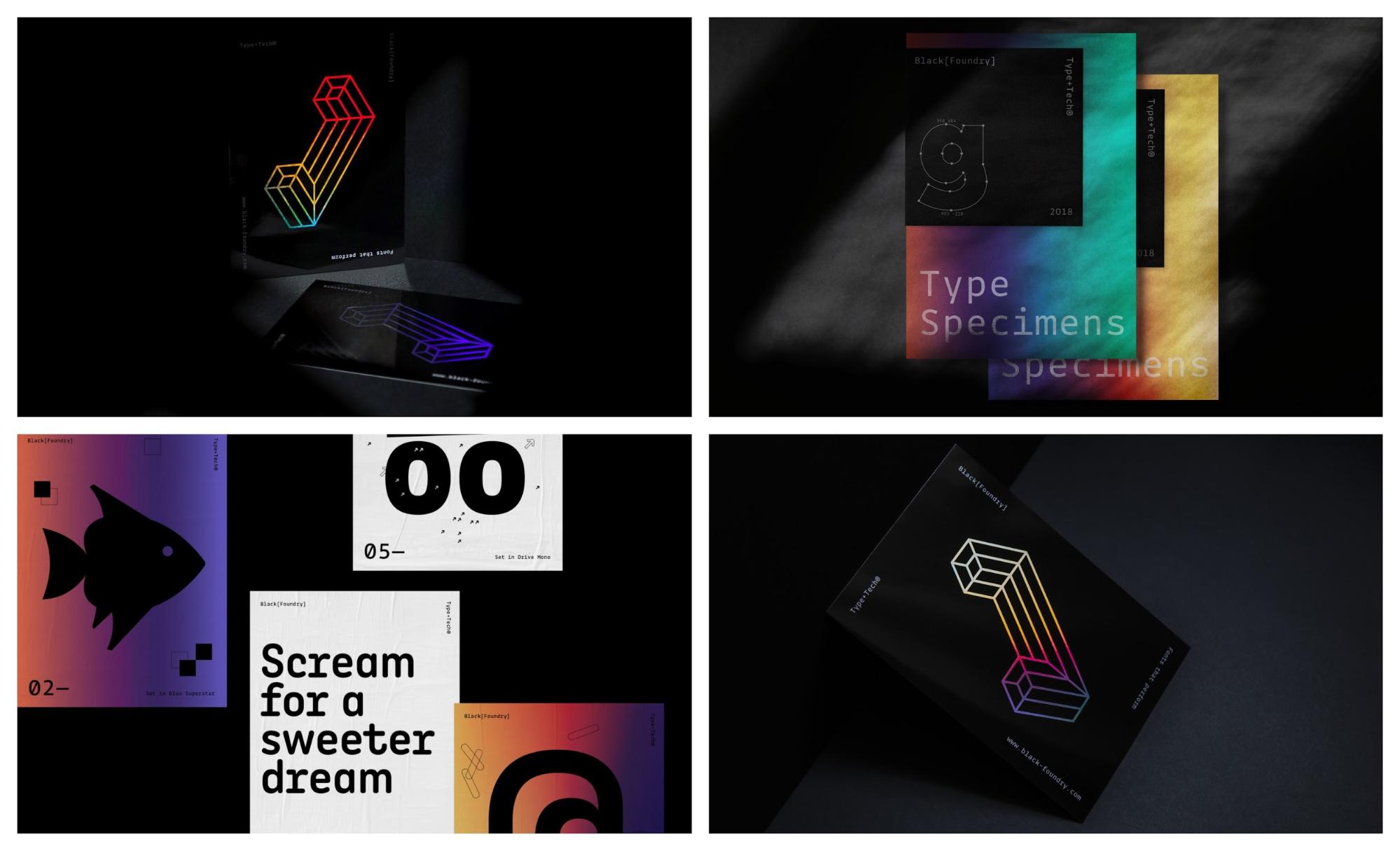
It honestly looks like they were able to combine almost all of the graphic design trends we have talked about so far with the minimalist ideals. We’ve got a bold font dominating a few graphics, a gradient peeking through and even a futuristic pattern making an appearance.
Now if you don’t want to go the color gradient route, you can still inject some color into your designs. In this presentation template example, they use only three colors to build an interesting visual:
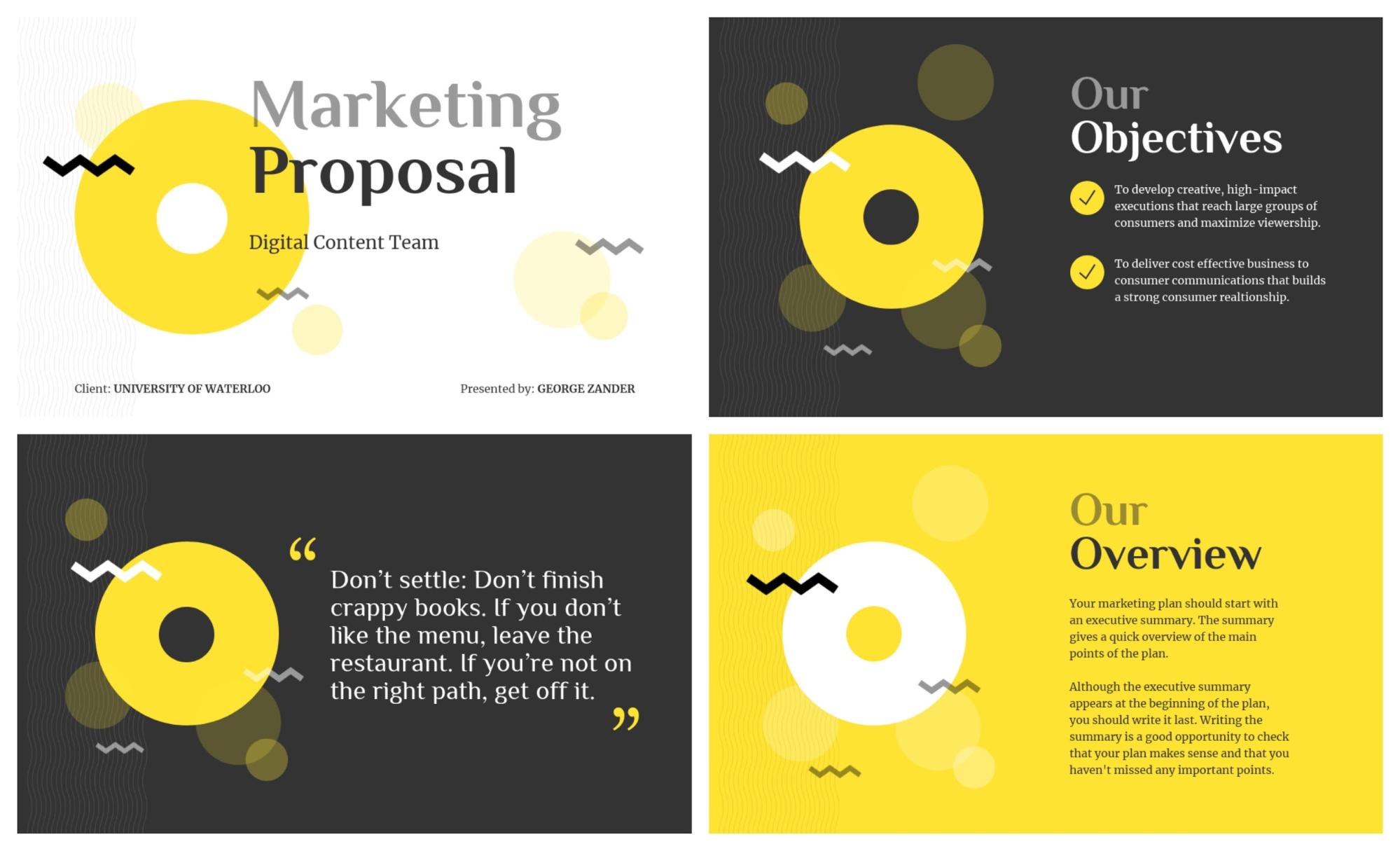
The slides use exactly the same layout throughout the whole presentation, only swapping the colors on each. This minimalist approach keeps the presentation cohesive and eye-catching, all without being too complex.
The designer used exactly what they needed to get their points across, no more and no less. And at its core, that’s what minimalism is all about.
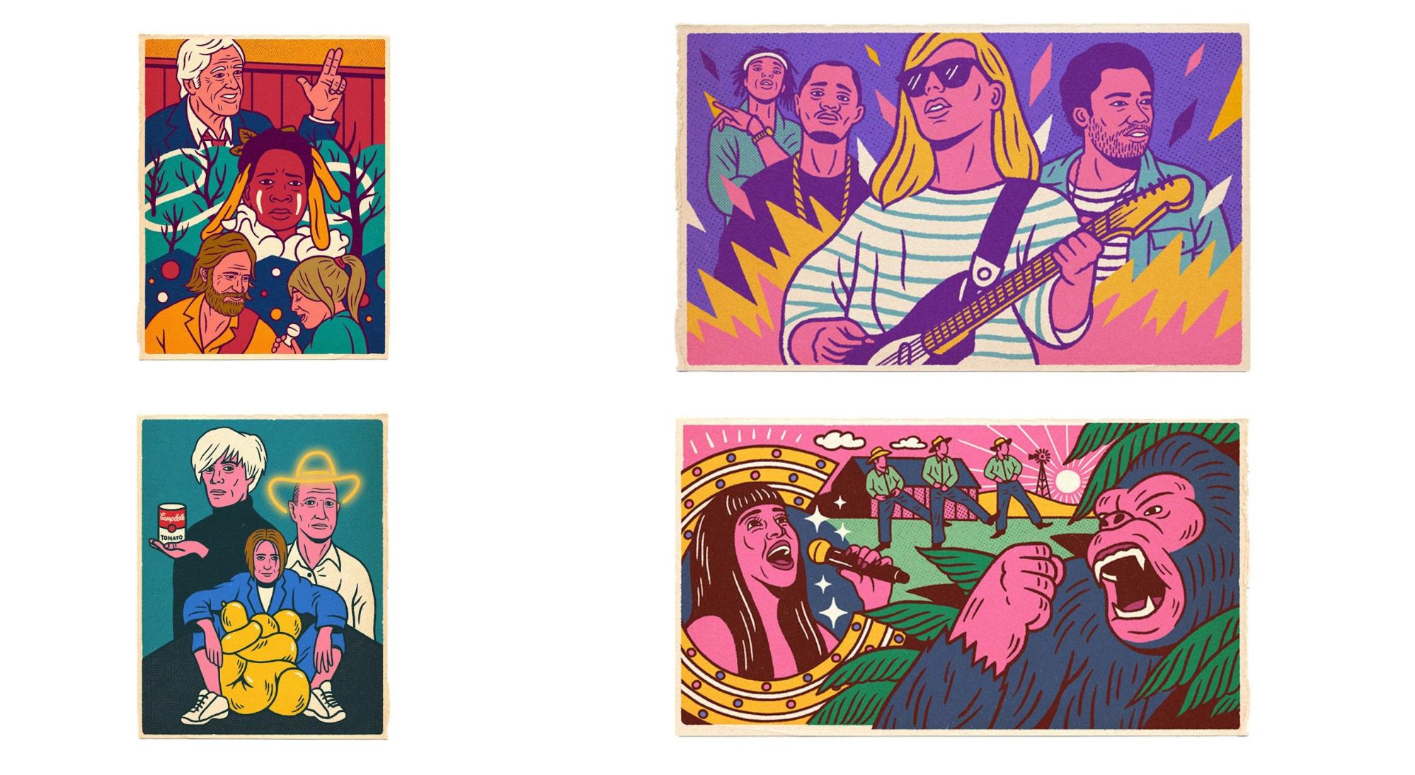
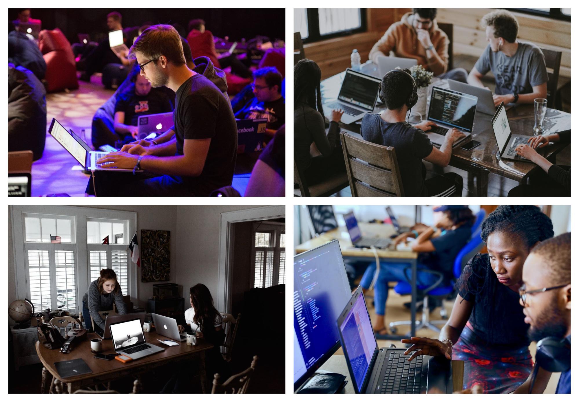
7. Dynamic and Complicated Hand-Drawn Illustrations
Custom or hand-drawn illustrations are an excellent way to make your visual content stand out. And stand above all the other brands that take the easy way out.
That’s because no other brand is going to be able to exactly replicate these visuals. Competitors can copy your color scheme, your social media strategy and the stock photos you use.
Plus, in the quest for a strong brand, unique content such as this is extremely valuable.
That’s why I believe that hand-drawn graphics and illustration will continue to be a graphic design trend this year.
However, like some of the other graphic design trends we saw roll over to this year, things are about to get a bit more complicated.
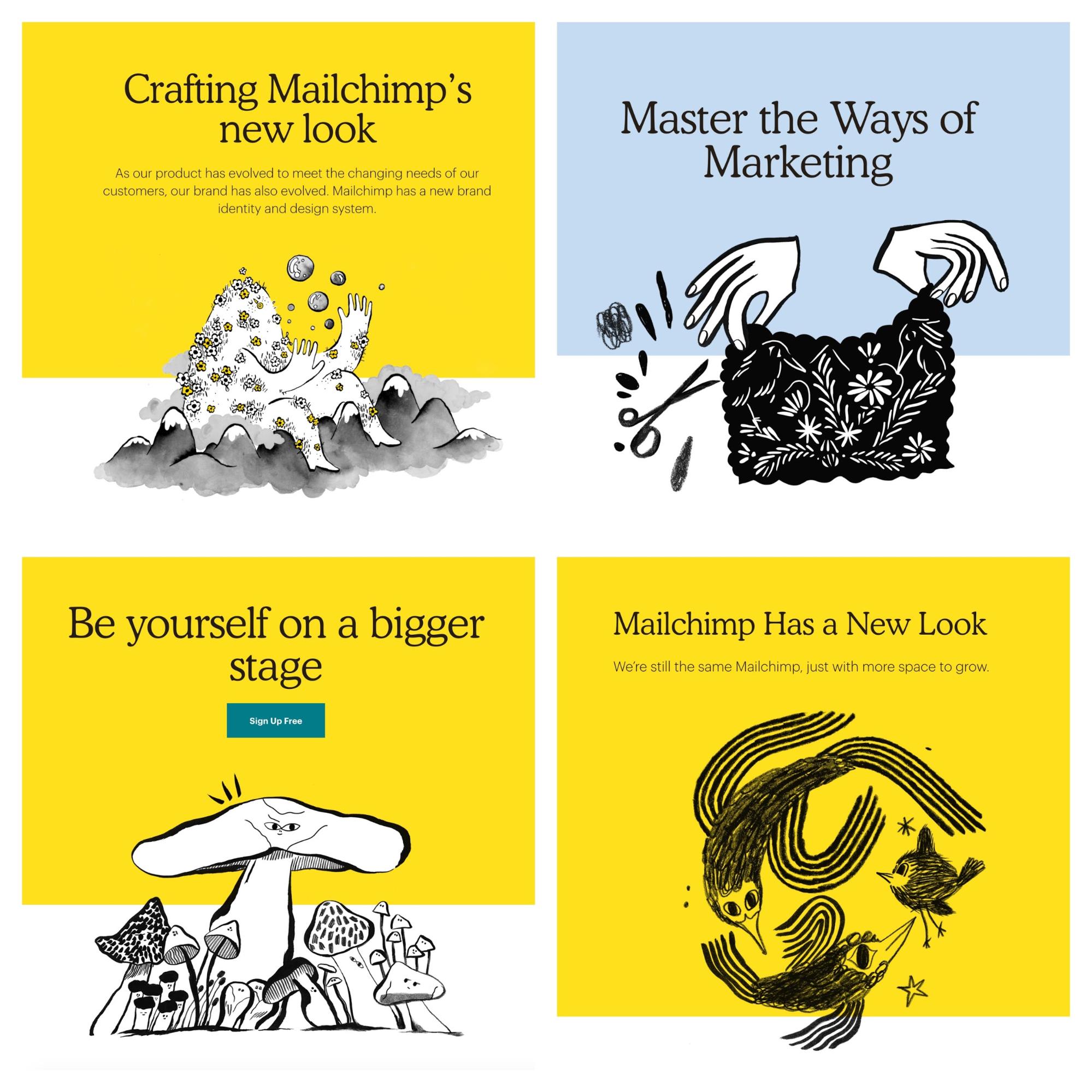
Last year you could get away with using simple flat doodles, like the examples from MailChimp below:
This year that’s not going to cut it! Because everyone else picked up on the simple sketch trend, it’s not unique anymore.
Like I said above, you’re going to have to take it to the next level with your hand-drawn illustrations and visuals.
Mailchimp, among others, has risen to this challenge and blown the doors off of it with their custom illustrations.
These illustrations were added to literally every page of their website, and all social media accounts. And I kinda love it.

Additionally, they used these custom illustrations to help inspire their customers to be themselves and embrace simplicity…as well as reject the overly polished company image that they see online every day.
Their designers have always been known to take big risks, and this one seems to have paid off. It was talked about by every designer and marketer for weeks after the rebrand was unveiled.
The project management masters over at Asana took a similar approach this year. Last year used the simple doodles and sketches throughout their marketing graphics.
But this year they invested in some more dynamic illustrations across their social media accounts:

I like that these illustrations look like they were all created by the same designer, which is very difficult sometimes. Especially when they have a whole team of designers working on one project.
This method makes each share or email from them look like it came from a single voice, that their readers can easily recognize.
In this noisy world that we all live in, that can be a huge benefit. Also, it’s nice to see them using some very vivid colors in their designs!
At Venngage we got the memo as well when we created this fun Halloween infographic:

One of our designers created each of the illustrations from scratch, and it makes me smile each time. There are a ton of similar Halloween infographics in the world, but ours is incredibly remarkable because of the custom illustrations.
To conclude, if you’re looking for a little more inspiration to create your own illustrated masterpieces, I would check out these examples from The New Yorker:
And the perennial innovators over at Slack:

They actually were one of the first companies that I noticed creating these works of art. And they have been creating amazing illustrations for their content ever since!
8. Authentic and Genuine Stock Photos
As you have probably noticed many brands are creating some very creative designs to seem more genuine. Or to make them feel more authentic, instead of a faceless corporation.
This push into the more real and genuine will be seen in the type of stock photos they use this year as well.
I feel that a lot of stock photos have become too professional, polished and vague. In their quest to reach as many people as possible, these photographers choose a safe subject.
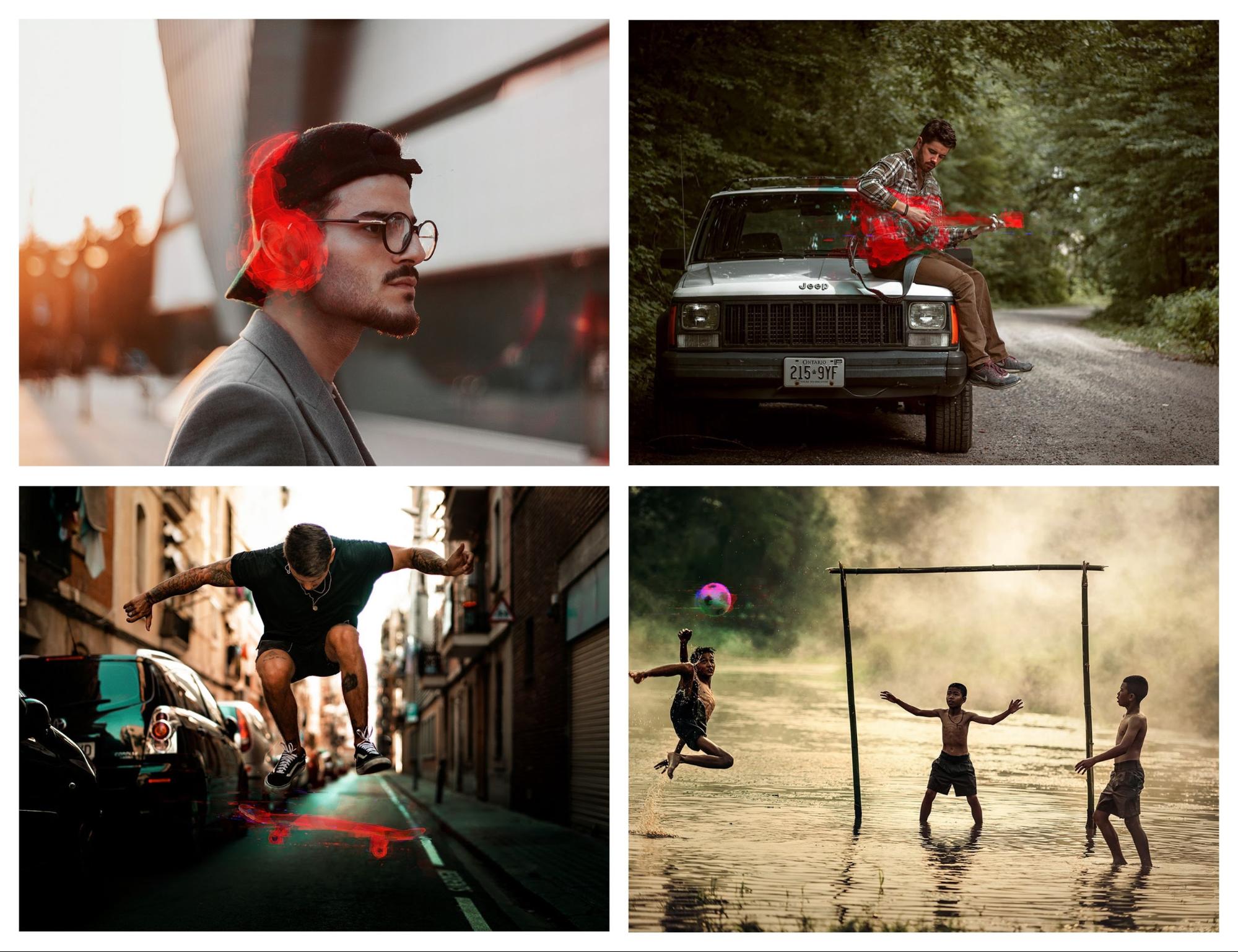
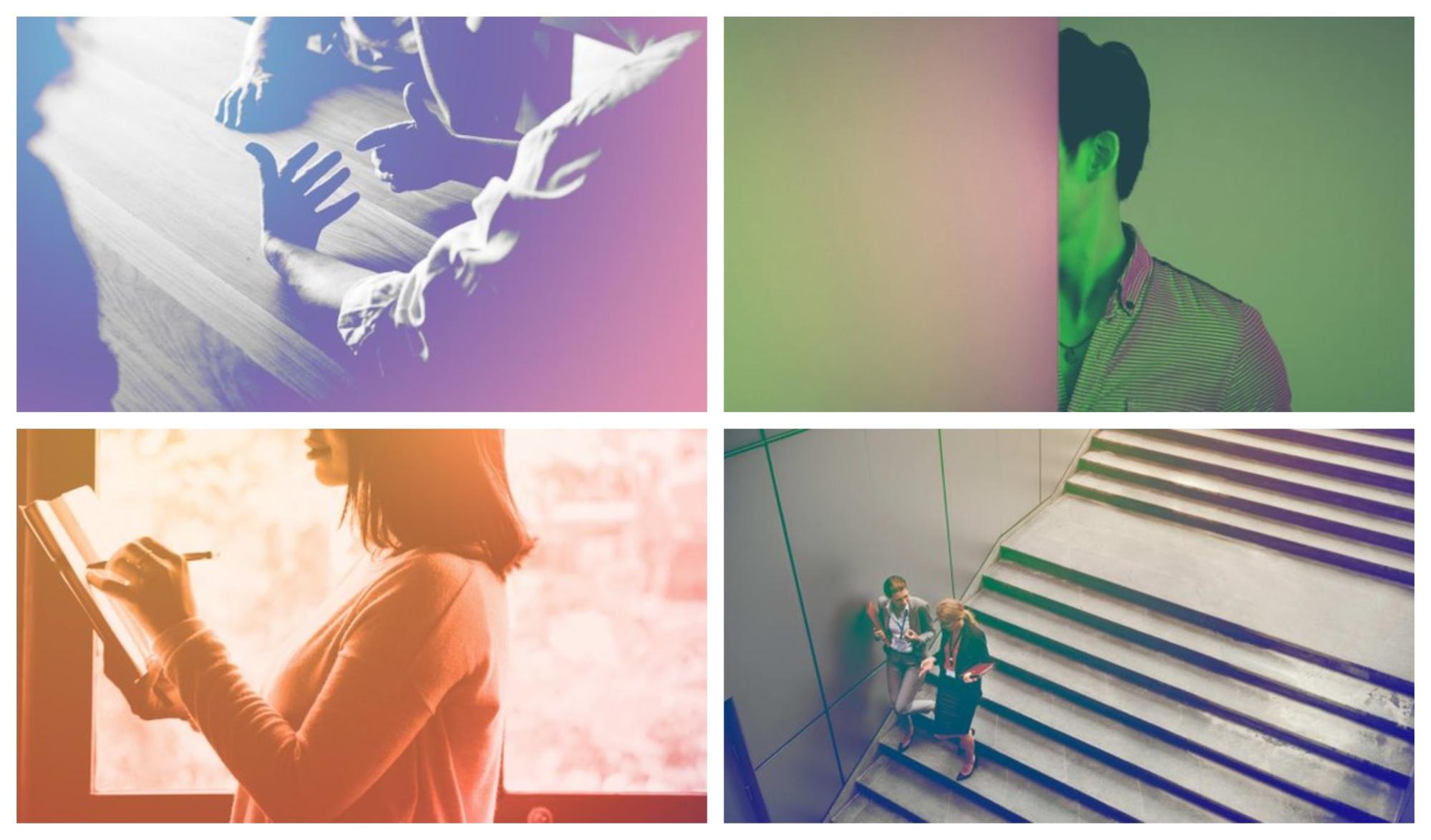
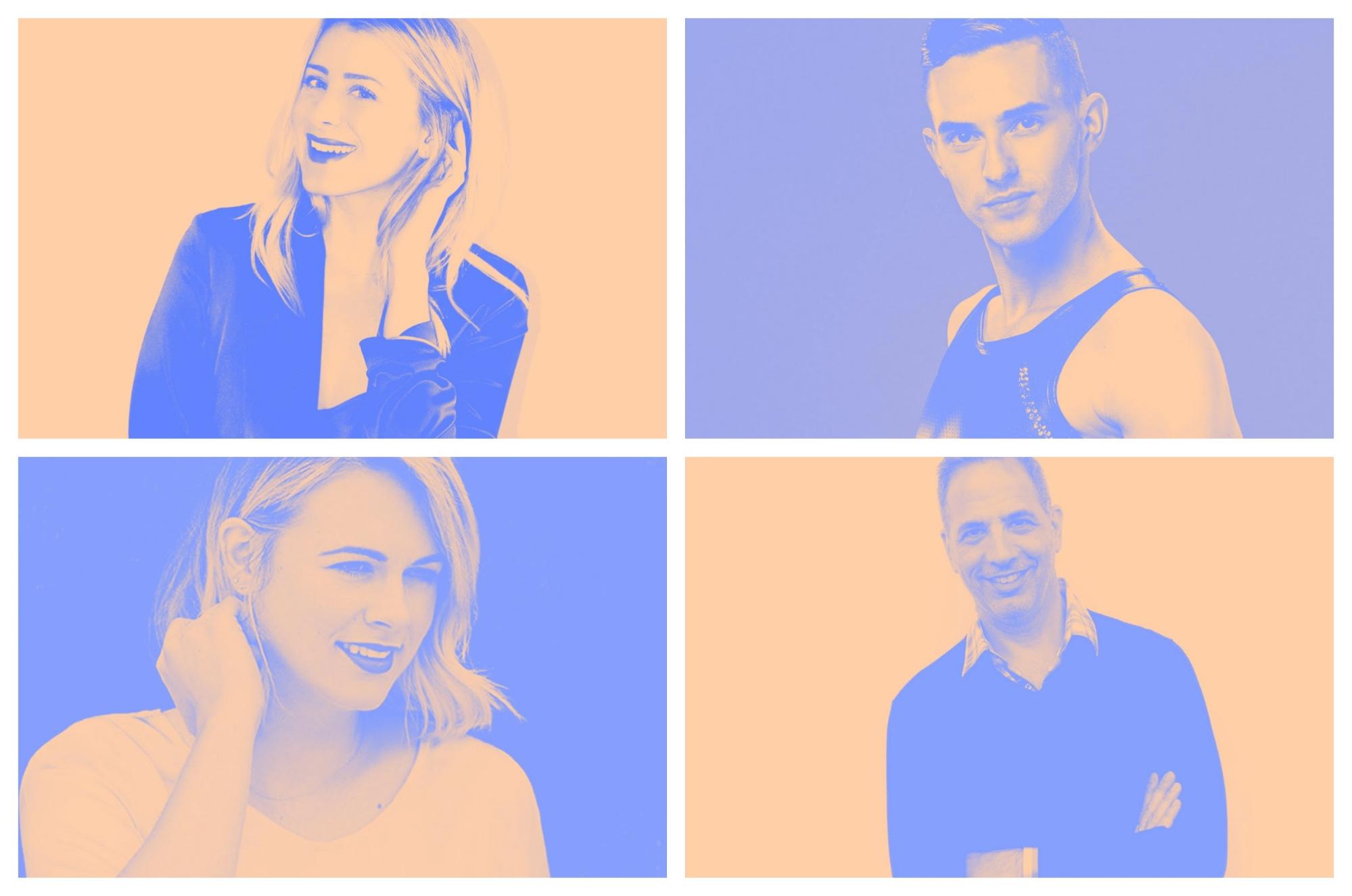
Overly edited photos are also out this year, readers really want more genuine and authentic looking photos of people. The viewer should be able to see themselves reflected in the photo.
These new stock photos look like they were taken with someone’s personal camera or phone. Kinda like the examples of people below:

These examples honestly look like they were taken by a bunch of friends hanging out, not by a professional.
The same thing can be said about these photos as well! In each of these free stock photos, the colors look real and not like it was overly edited:

Almost like something you would see in your Instagram feed from your cousin that travels too much.
And I was able to find those examples relatively easy, so it baffles me when brands all use the same generic photo.
Those ultra-generic pictures that might relate to the content should be avoided this year. Like this example, which has been used by almost every tech company at least once:

As a reader, this photo tells me nothing about your content because it’s so general!
Instead, shoot for photos that help you tell a visual story and add to the narrative. Instead of just filling an open space on your blog or social media feed!
For instance, compared to the example above, these photos would work much better in a tech-focused blog article:
Like I said previously, these photos depict a real scene that you could put yourself into. And they feel like they were snapped in the moment.
Not meticulously planned like some of the examples below:
Ugh, that fist bump photo makes me cringe a little bit.
Now in my experience, the laziest content creators love the generic and overtly planned stock photos. Ones that took them a few seconds to find, and have already been used by millions of people.
I hate those kinds of stock photos.
I mean, if you can’t take the time to create or find a better stock image, why should I take my time to read it? I think many of you will agree with that statement.
And best of all, you can find these great examples and millions of more stock photos for FREE on Venngage now:

So in 2019 don’t be one of those creators, instead strive to be more weird, unique and genuine with your visuals!
Comments
Post a Comment